Author Archives: Nick

The tip of the User Experience iceberg

Some websites provide more of an experience than others, but the number of web agencies and even individuals who offer User Experience in their list of ‘services’ indicates there’s a chunk of lip-service being paid to what has become an almost industry-specific buzzword.

Although many techniques and approaches to UX have been honed and made popular during online projects, if New Zealand businesses associate User Experience only with making a well considered website, the power of taking a user-centred approach will be diluted and practitioners risk limited uptake from business in the design/research/strategy of their other channels and customer touch-points.

There’s so much more ground to cover and value to offer away from the web and I hope I’m not alone in my ideal that businesses and organisations should involve customers in the planning and design of all facets they interact with, on and offline, physical and virtual.

Tell me I’m not alone…

When less is less and more is too much.

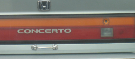
Honda. Door handles optionalThis Honda trunk-lid has been simplified and streamlined so much that the owner has crudely screwed on a ‘hardware store’ handle to make it easier to use.

Mazda. Where is the 'forgot pin' button?This Mazda door entry has gone the other way by adding complexity; a key-code entry, which looked to me like it had never been touched, whereas the standard key-hole had seen plenty of action.

Less features or more?
Your new product needs a point of difference in a crowded market, but there’s a fine balance between adding features and taking them away.

The key to this balance lies in how useful and intuitive it is for the end user.
In these examples, the product teams have gone out of their way to either simplify or complicate a conventional and accepted way to open a car door, at great cost to the carmaker, and with no benefit for the end user.
So, how can you tell which way to go?

  • When does more become too much, and less not enough?
  • At what point does the investment your customer has to make in adapting their behaviour to a new design outweigh its benefits?
  • Exactly how minimal can you go when stripping back those features to make your customer use your product without having to think about it? (let alone hack it to make it more usable).

User research
We can get a good feel for where this balance lies by watching the way people use existing products and prototypes of new ones, gaining an understanding of what they need and don’t need, what works for them and what doesn’t.
If either of these two carmakers had spent time purposefully watching their customers use a prototype of these products they would never have made it to market.

…or perhaps Honda just wanted to sell door-handles as a premium accessory?

Picture, or thousand words?

design-research-processOutcomes of UX research projects can be difficult to put in a nutshell, and a bullet pointed list sometimes just does not cut it.

As well as the usual deliverables emerging from a brief, I sometimes add a rich picture as a visual summary. These often originate from doodles generated while I’m trying to figure out relationships or flow between elements of a process etc.

What starts out as a way for me to make sense of a complex landscape often grows into an important tool to communicate this to client teams.

The ability of these info-graphics to engage people often amazes me, with the drawing sometimes becoming the focal point of discussion, receiving more attention and air time than the agreed deliverable.

This week my consultancy website www.bowmast.com turned 10 years old so I gave it a refresh.
Out of my doodles came a drawing attempting to summarise the design research process as I see it.
It’s on the home page if you fancy a gander.

Happy Twenty-Ten to you all.

Air New Zealand listens to customers. Or do they?

Watch campaign clip on YouTube

A UK based Air New Zealand campaign highlights the attitude and friendliness of cabin crew as something uniquely kiwi.  The idea for the campaign was apparently inspired by a passenger’s tweet;

air-new-zealand-tweet

… but given that the tweeter is a London-based digital marketing consultant who’s own website has a page of  “10 reasons why you should engage your customers in an online conversation”

…I’ll let you be the judge of how genuine this is.

Customer blogs and tweets about your product can act as a great barometer of how your customers perceive your product or service.

With most airlines competing on price, this campaign shows Air New Zealand as being responsive to customer feedback, and focused on the in-flight passenger experience.

When you look at the dozens of touch-points involved in a travel experience; research, planning, booking, in-airport routines, transfers and accommodation details that sandwich the actual flight, it can almost dwarf the on-board component of the passenger experience. Especially for short flights.

An Airline I worked with in the UK carried out an ‘Experience evaluation’ seeing and measuring the entire process through a customer viewpoint; from the inspiration to take the trip, right through to uploading your photos when you’re home. By identifying which of the touch-points work well and which ones frustrate passengers, these airlines can identify ways to improve the passenger experience.

This ‘personality allowed’ campaign is aimed at long haul flights where the actual flight is likely to be the memorable aspect, hopefully blanking your memory of the queues at immigration and perhaps even something worth shouting, or tweeting about.

Prototype, Test, Rinse & repeat

prototyping-user-experience

The value of iteration.

Switched-on digital agencies understand the value of user testing with early stage website mockups; ironing out sticking points and identifying opportunities to improve interaction design early, before committing to code.

During a day of back-to-back user interviews, ‘quick wins’, like changing a navigation item can be made in seconds and validated (or not) by response from subsequent research participants.

…But how possible is this rapid-fire iterative improvement in the design of physical products?

Lately, I’ve been helping a Christchurch company take a User Centred approach to refining the design for a new type of mouse.

The industrial designers at 4ormfunction produce fresh batches of prototypes using shaping compounds then scan & print in 3D. This makes for quick builds of fully functional prototypes. They look a little sketchy, but are perfectly suitable for user research where ergonomics are being explored.

Continuous customer feedback = continuous improvement.

This ‘turn on a dime’ flexibility allows an iterative approach; Designers respond to insights and observations from natural use with potential customers, build a new round of design variants, then put these prototypes through the next round of user research to further refine the design.

It’s not as quick as shuffling pixels, but It’s a great realisation to me that such complex objects can realistically be put through a quick cycle of: prototype / user research / analysis / …repeat.

Banking on Usability?

banking-on-usability

This ad from Kiwibank shows a customer turning to rage while checking his balance online   …presumably on a competitor bank’s website.

Banks were one of the first industries to take their services online in New Zealand, so after more than a decade to fine tune their customers’ online experience…

…should user-friendliness really be a point of difference?

UX in the physical world

Individual user experience in the physical world. Custom built surfboards.
This project from 2009 allowed me to work on interactions with a different kind of digital – gripping fingers and thumbs, … taking me back to my surfboard building days.

A kiwi company was developing a new type of mouse. I’used UX methods to help refine the design, starting off with some user research to understand how people will use it.

Working with a physical object so closely tied to the task at hand is a challenge. Asking people how they’d use it can be misleading as they often struggle to articulate what they want from a product they aren’t always conscious of using.

This really takes me back to my first encounter with User Centred Design – making custom surfboards in the early 90’s.

My first customers would fill out an order form with their height, weight and suggested measurements for the board. These were often based on their vision of riding in a certain way, on waves which often only happened twice a year, or in their dreams.

When viewed through the right lens, observing people use a product can convert directly into design requirements to improve the user experience.

Wherever possible, I’d go surfing with my customers, to get a feel for their riding style and the conditions they most often rode in.  Watching them ride provided a more reliable brief of what they needed from a board than they’d written on the order form.

When you’re riding the right board, you forget it’s there; it’s like an extension of your body. Making the board ‘disappear’ was my measure of whether I’d made it right for the rider. (As well as the smile on their face at the end of a session)

Using a mouse with your computer is similarly sub-conscious but it’s not a sport, and doesn’t need to make you smile.

… but there’s a first time for everything.

Running. A user centred business.

Where can I go for a run around here?

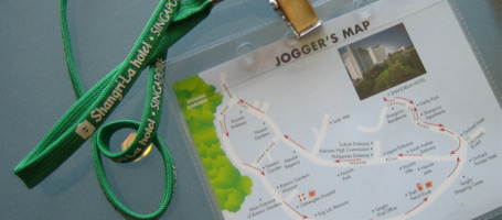
Concierge at my hotel in Singapore only needed to be asked this a few times before they found themselves offering directions.

…But all too often they’d spot their guests returning by taxi after getting lost in the suburbs.

This jogger’s map started out when a staff member sketched a suggested route over a city map for a guest. This evolved over time through photocopied and laminated versions into this runner-friendly neck-tag.

Not everyone’s idea of going for a run is the same, so hotel staff asked sweaty runners how far they ran and looked at the ways they folded their improvised city map. This way they could adjust the route and the boundary of the map to suit all levels of runner.

I love the way this jogger’s map came about, it’s like a condensed example of a User Centred Design process:

  • None of the staff were runners themselves
  • …but they strove to understand their customers
  • …they generated a solution in response to an observed need
  • …evolved the design through user feedback
  • …and iterative improvements
  • …adjusting the design to suit the context of use
  • The result benefits both the business and the customer

It’s also a good example of how the little things can make the a big difference.

Chocolate on the pillow is always a nice touch and a no-brainer for hoteliers. …but businesses who listen to and observe their customers are in the best place to discover new and sometimes simple ways to provide both a point of difference and an improved customer experience.

Making the most of Optimal Treejack

If you want to find out how well your website navigation structure works for your customers, Treejack is a great tool for the job.
If you want to know why certain parts performed poorly, and what to do about it, you’ll need to get inside the head of your customer. The tools for this are your eyes and ears.

Treejack, was developed in New Zealand by Optimal Workshop so has been built with a user-centered approach in mind.

It’s a tool to test the navigation structure of your website. Treejack will pinpoint the most difficult areas or items to find, based on click-trails as survey participants navigate through a prototype of your website’s structure. (the prototype is a simple ‘tree’ of text links generated from a spreadsheet you paste  in… couldn’t be easier)

Treejack is a great tool, saving time and headspace, but it is no silver bullet.

You’ll get summarised and detailed outputs showing where each participant went, how directly and quickly they found set items during the survey. … but it won’t tell you how much sense it made to them, or why the tricky areas were confusing.

To design a website that’s intuitive to navigate it’s essential to understand how your customers will interact with it. There is simply no substitute for observation when it comes to gathering these insights.

Teaming Treejack up with qualitative one-on-one research makes a killer double-act bringing you the best of both worlds.

Some tips for integrating Treejack into user research sessions:

  • Run a warm up exercise on a generic ‘tree’ … Clicking through a bare-bones navigation is quite abstract so this helps participants get used to the interaction style.
  • Encourage participants to ‘think aloud’ while using the prototype. When you notice them pause, they’ll be thinking. Having them vocalise their experience is the closest you’ll get to knowing what’s behind their thoughts and any indecision.
  • Save your questions till after each task. Interrupting the participant mid-flow can make them change their behaviour, skewing the Treejack report. Let them click through naturally then discuss it afterwards. You’ll need to rely on your note taking here.
  • Have a duplicate Treejack survey open in another tab. This way you can ask participants to re-trace their steps without affecting the Treejack results.
  • Ask the participants to ‘rate’ each task for how much sense it made to them etc. Treejack tells where and how they found the item, but doesn’t tell you whether this made sense to them.
  • More participants, fewer tasks. As people develop a familiarity with the ‘tree’ they will start memorising where things are, making your findings less useful.
  • Use your eyes. The old adage, “it’s what they do, not say” is as relevant as ever here.

I’d be interested to hear anyone elses experiences …
Go check it out at www.optimalworkshop.com/treejack.htm

An augmented reality-check

Classic lack of end user understanding here from Weet Bix.
A marketing campaign using augmented reality aimed at early teenagers fell at the first hurdle owing to the myopic vision of those who designed the campaign.

Young All Black fans were supposed to hold a card from their cereal packet up to their webcam to experience their favourite player on screen in 3D.  .. all good in theory,
…in practice the promotion involved a lengthy signup, third party app. download and installation plus a browser restart, etc. etc.

Hardly the recipe for a campaign designed to spread by word of mouth.

Trent from Optimal sums it up nicely when he poses the question “did they ever sit down with a 10 year-old and get them to use it?”

Ben Gracewood runs through the ‘experience’ through the eyes of a 10 year old on his blog

… so, why couldn’t the marketing team see it this way?

Design teams make assumptions about their audience, project their own goals and needs onto the project and become too close to their products, losing sight of the big picture.

Usability testing with the target market at an early stage would have identified signup and installation barriers and very likely forced the team to rethink the way the campaign was rolled out. … before it was rolled out. Products are significantly cheaper to correct at prototype stage than post-launch with egg on your face.

Something tells me here that the campaign was pushed through despite its clunky user experience simply because the marketing team were so in love with the concept of augmented reality.

A shame their target market don’t share the love.