Category Archives: User research

10 tips for usability studies with children

Usability-with-kids

Children are some of the most demanding and discerning users of interactive products, making them difficult to design for and challenging to moderate in a usability or UX research situation.

Whilst they can’t always articulate their thoughts and you can’t rely on what they say, with a careful approach you can generate incredibly useful design feedback by watching them use a product.

Before kicking off a recent project with with 7-14 year olds, I spoke to teachers, parents and others who have worked with this age group. I’ve added to their collective advice:

1. Have a guardian introduce you

Kids will trust you if their parents do, so meet them first, then have the parent introduce you, they’ll also do a better job than you can.

2. Avoid letting the guardian sit in
Kids behave differently when they know their parent is watching.

3. Explain everything
Kids have an amazing bullshit detector. Be transparent about the purposes of the research and why they are  involved.
The usual upfront introduction to the purpose of the research cannot seem like a formality with kids, tell them why they are involved, let them ask questions at the beginning, or they may ‘sit’ on a question waiting for a time to ask it.
Explain any recording equipment. Kids will be distracted by their curiosity so get all the waving to camera etc. out of the way at the start.

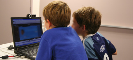
4. Use pairs of friends
Pairs feel more comfortable with a stranger (safety in numbers) and are less likely to get stage fright.
Have them take turns interacting, leaving the other free to talk. This can be difficult to manage at times but creates a great dynamic generating rich feedback.

5. Start easy
Kids, (esp. boys) don’t like to be wrong. Make sure they feel confident and reassured by asking super easy icebreaker questions like; “what are your favourite …” etc.

6. Free range
Thinking aloud while using a product can be very distracting for kids and results in unnatural behaviour, so aim for free-range activities with absolute minimum instruction. Slip into the background as much as possible while they are interacting with the product.

7. Together, then one at a time
Start off directing questions at both kids together before addressing them individually, this saves you putting one of them on the spot and will also help you work out and manage the dynamic when one kid dominates.

8. Choose your words carefully
Try to match your language with the kids (particularly nouns). This might mean you refer or point to ‘things’ until they fill the gaps, then gradually adopt their descriptive terms.

9. Leave the room
Choose your timing and make an excuse to exit the room (assuming you have observation facility). This is the best possible way to observe natural behaviour. Don’t blow your cover though, if you say you’re going to get them a drink, bring one back.

10. Don’t load them up on e-numbers
Their concentration levels can quickly evaporate once sugary or coloured foods kick in leaving you short-changed of feedback. …and their parents will curse you on the ride home.

Anyone want to make it a top 11 or 12 ?

UPDATE: I stumbled across a more theoretical article about usability testing with children. It’s coming from a more academic and psychological angle.

UX research. Making every minute count

ux-research-interview-clock

Facilitating ‘face to face’ interviews with your clients’ customers is central to UX research. It’s also one of the most difficult of all UX skills to develop.

Valuable insights can be generated and captured during each session but you’re often having to cover a lot of ground in the time allocated.

After hundreds of these sessions I still find myself so deeply immersed in observing the participant’s experience of the product that it’s easy to lose track of these precious minutes, dwelling on one activity or area of focus at the expense of another.

I thought I’d share this very simple tool to help keep track of time and make the most of every minute of these sessions. It’s basically a modified clock face.

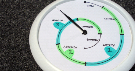
Grab yourself a wall clock and cut out a new paper face. Cut a slit from the edge to the centre so it can be slipped around the arms of the clock. Mark and name your time allocations on the new face.
At the beginning of each session, just wind the minute hand back to the start and you’re on your way.

For a 90 minute session mark the segments on a spiral going inward, like in the picture of this one I used recently. Oh, and I removed the hour and second hands too.

Apology, or invitation. What’s your message?

Are you being served?

If this were a checkout operator speaking to you, which would you think was most friendly and helpful?

Two signs; Same context, audience and purpose. More design effort has gone into one, but it is the choice of words here which has the most impact on the message they convey.

So when it comes to fine tuning a digital user interface, why is there such a focus on graphic interaction design elements, often tweaked to the nearest pixel with less importance given to copy and messaging?

Refreshingly, a recent website usability project came from the opposite angle. My client had accepted they were deeply immersed in the technical nature of their product and their way of communicating it was out-of-whack with terms their target market would relate to.

The team realised that regardless how perfectly their visual design and site architecture presented their product, it was the words they used to communicate their product which would make it fly…. Or not.

Working with a technical copywriter we were able to identify phrases which really resonated with people, which to avoid and critically, what copy should be ‘front and centre’ to engage and convert potential customers.

During the flow of research participants, we made copy changes on the fly, gaining immediate reaction to provide a rapid cycle of improvement.

As well as taking us down the path of making sense and talking people’s language, it was a strong lesson to get rid of that ‘lorem ipsum’ placeholder text as early as possible when getting feedback from customers.

Skype takes the hassle out of remote usability

Remote research brings cultural relevance to usability findings, providing the kinds of insights which can only be gained by being there…virtually at least.

I recently ran some remote website usability sessions for a Kiwi startup whose main customer is in the U.S.A. … sure, ‘isolation breeds innovation’ and all that, but when your customers are on the other side of the world, it’s vital that your product connects with them.

A fun project, but choosing which software to run during the sessions was a headache… There’s a boggling number of services to choose from (25 on this link) and there’s no clear winner.

After some experimenting, I went with Skype and it did the job nicely.
Here are some benefits over paid and more sophisticated software I’ve used previously:

  • It’s easy to recruit participants who already use Skype
  • Familiarity means no learning curve for you or participants
  • No install means no wasting valuable session time setting-up
  • Sending links and files is instant with built-in messaging
  • It’s possible to make contact with participants prior to the session
  • It’s free, so that’s hard to argue with

During the sessions, I was able to video chat with the participant for a while, then fire up Skype’s screen-sharing tool, so I could observe their movements on the website while  hearing their thoughts and reactions etc.

Skype’s screen-sharing only works between two computers so if you have clients observing, this will have to be through an external monitor (Make sure they are sitting out of view of your webcam and preferably out of earshot).

The project generated rich insights and shaped the design process moving forward.
I’d definitely use Skype for this again, but would love to hear from anyone who’s used anything else with success.

I also had Adobe Connect recommended …anyone tried that?

Keeping it ‘old school’ with Diary Studies (Or not)

Yep, the original article from 2010 has mutated and is now about halfway down this page because:

UPDATE 2017. Seven years on and the landscape of remote diary and journalling services has exploded.

I’m always looking for better ways to understand customer behaviour and the experiences customers have in their own context, out in the wild.

The latest of these is Streetbees, ‘your eyes and ears on the street’ which has coverage in 87 countries and looks like a ‘selfie’ version of remote usability testing service usertesting.com, where consumer ‘bees’ get paid a small sum to film their impressions while they complete a task. I’m seeing insights dripping in honey.

… and Over the Shoulder, less of a DIY tech platform and more of a managed service for qualitative mobile ethnography.

Also… I believe Sarah Cambridge has the definitive article on Diaries here on a slideshare:


Also… I’ve now had a crack at running a video diary study (with a camera couriered out to each person), with great success, and in the ‘how-to’ article show you what’s involved with some tips from my experiences. Article here: Capture the moment with video diary studies

REMOTE DIARY SERVICES / PLATFORMS:
There are some interesting ‘mobile ethnography’ tools on the market, using web and mobile channels to capture, collate and filter all this stuff as it occurs in the field:

7daysinmylife …Which might be more ‘manual’ than it looks.
Consumerthink …Which appears to do everything. Hmm. I guess you have an account manager to build out the tool to fit your project.
CX Workout A mobile diary and ‘co-design’ platform which apparently builds journey maps. 
D Scout Which has fast become the UX researcher’s favourite way to capture participants’ ‘mobile moments’ during diaries, lifestyle and retail studies.
Experiencefellow …Why not slip into your customers’ shoes?
ethosapp …’An ethnographer in your pocket’, apparently.
Overtheshoulder … Seems similar to Streetbees, but less of a DIY platform and more of managed service.
Revelation … A versatile platform at a premium price …with what look like some useful data analysis tools.
Streetbees, more (and probably more reach) in the moment video vox-pop.
thethinkingshed …Which seems to be like a blog platform for your participants.
Watchmethink …for some in the moment video vox-pop.
webnographer …Which smells like a remote usability tool.
Voxpopme … Which is a little like Watchmethink, but with an impressive transcription and compiling function. I’ve tried a beta of this and while a bit clumsy for long form, it’s great for highlights and the technology is going to be truly amazing one day.

From speaking to John, the founder of ‘Watchmethink’, it seems quality and motivation of the sample is the big ‘gotcha’ here for serious researchers – as opposed to vox-pop collectors – so quite possibly the way to get the most from these services is to do your own recruit and just use the tool as a platform. 

WEARABLE GADGETS:
Oh, and here are some filming gadgets which ‘log’ activity from the subjects’ point of view:

Autographer
Narrative Clip
Looxcie

Now… here’s that original article:

Keeping it old school…

Impressive technology, but ‘whizz-bang’ isn’t always the answer. I sometimes stick to the traditional pen and paper approach for a diary study, as this also has it’s benefits over the digital tools which seem so tempting…

For the uninitiated, diary studies in UX are a qualitative research method where participants record events, interactions, attitudes etc. in diary format over days or weeks. They are a great way to study customer behaviours in the context using a product or service over time, as opposed to during a traditional in-context interview.

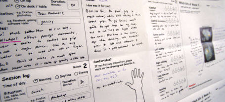
In the study which prompted this article back in 2010 I was interested in how and where people used a prototype mouse in their day to day activities and how well it performed in each situation.

For a mouse project I had users try different prototypes and rank them against each other during a week... using paper forms.

For a mouse project I had users try different prototypes and rank them against each other during a week… using paper forms.

Here are some ways I feel the old-school method holds its’ own:

It’s human
No learning curve, no teething problems. Paper and pen doesn’t require login details, needs almost no instructions, is ultra portable, and doesn’t rely on web or mobile coverage. Participants don’t have to think about or remember anything other than jotting down their thoughts.

It’s flexible
Photos are great, and really help to add context, but I’m always amazed at how pictorial some people make their diary notes. Sketching and doodling on a blank sheet of paper is always going to win over an online text-entry box.

‘till the fat lady sings
The real gems from these studies emerge in the exit interview with each participant. When they’re looking back over their own handwriting, these paper diaries transport people back to those moments in time, where you can access the rich detail needed to paint the full picture. It’s literally a trigger for them to share stories, which is where the ‘gold’ always reveals itself in interviews.

It’s immersive
I love the process of pinning-up diary data around a room.
Having met each participant, built rapport and empathy, this is somehow retained when you’re surrounded in their scrawl. All those attitudes and responses pop back in your mind, help you get into their character, see things through their eyes and in relation to their context.

When the right type of project comes along, I’ll give the ‘digital ethnography’ tools a shot, but until then, I know I’ve got paper.

UPDATE 2015: I’ve now had a crack at running a video diary study, with great success.

Even so …I’d love to hear from someone who’s run an ethno project using any of these tools.

When less is less and more is too much.

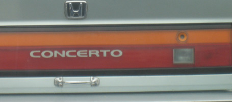
Honda. Door handles optionalThis Honda trunk-lid has been simplified and streamlined so much that the owner has crudely screwed on a ‘hardware store’ handle to make it easier to use.

Mazda. Where is the 'forgot pin' button?This Mazda door entry has gone the other way by adding complexity; a key-code entry, which looked to me like it had never been touched, whereas the standard key-hole had seen plenty of action.

Less features or more?
Your new product needs a point of difference in a crowded market, but there’s a fine balance between adding features and taking them away.

The key to this balance lies in how useful and intuitive it is for the end user.
In these examples, the product teams have gone out of their way to either simplify or complicate a conventional and accepted way to open a car door, at great cost to the carmaker, and with no benefit for the end user.
So, how can you tell which way to go?

  • When does more become too much, and less not enough?
  • At what point does the investment your customer has to make in adapting their behaviour to a new design outweigh its benefits?
  • Exactly how minimal can you go when stripping back those features to make your customer use your product without having to think about it? (let alone hack it to make it more usable).

User research
We can get a good feel for where this balance lies by watching the way people use existing products and prototypes of new ones, gaining an understanding of what they need and don’t need, what works for them and what doesn’t.
If either of these two carmakers had spent time purposefully watching their customers use a prototype of these products they would never have made it to market.

…or perhaps Honda just wanted to sell door-handles as a premium accessory?

Picture, or thousand words?

design-research-processOutcomes of UX research projects can be difficult to put in a nutshell, and a bullet pointed list sometimes just does not cut it.

As well as the usual deliverables emerging from a brief, I sometimes add a rich picture as a visual summary. These often originate from doodles generated while I’m trying to figure out relationships or flow between elements of a process etc.

What starts out as a way for me to make sense of a complex landscape often grows into an important tool to communicate this to client teams.

The ability of these info-graphics to engage people often amazes me, with the drawing sometimes becoming the focal point of discussion, receiving more attention and air time than the agreed deliverable.

This week my consultancy website www.bowmast.com turned 10 years old so I gave it a refresh.
Out of my doodles came a drawing attempting to summarise the design research process as I see it.
It’s on the home page if you fancy a gander.

Happy Twenty-Ten to you all.

Prototype, Test, Rinse & repeat

prototyping-user-experience

The value of iteration.

Switched-on digital agencies understand the value of user testing with early stage website mockups; ironing out sticking points and identifying opportunities to improve interaction design early, before committing to code.

During a day of back-to-back user interviews, ‘quick wins’, like changing a navigation item can be made in seconds and validated (or not) by response from subsequent research participants.

…But how possible is this rapid-fire iterative improvement in the design of physical products?

Lately, I’ve been helping a Christchurch company take a User Centred approach to refining the design for a new type of mouse.

The industrial designers at 4ormfunction produce fresh batches of prototypes using shaping compounds then scan & print in 3D. This makes for quick builds of fully functional prototypes. They look a little sketchy, but are perfectly suitable for user research where ergonomics are being explored.

Continuous customer feedback = continuous improvement.

This ‘turn on a dime’ flexibility allows an iterative approach; Designers respond to insights and observations from natural use with potential customers, build a new round of design variants, then put these prototypes through the next round of user research to further refine the design.

It’s not as quick as shuffling pixels, but It’s a great realisation to me that such complex objects can realistically be put through a quick cycle of: prototype / user research / analysis / …repeat.

UX in the physical world

Individual user experience in the physical world. Custom built surfboards.
This project from 2009 allowed me to work on interactions with a different kind of digital – gripping fingers and thumbs, … taking me back to my surfboard building days.

A kiwi company was developing a new type of mouse. I’used UX methods to help refine the design, starting off with some user research to understand how people will use it.

Working with a physical object so closely tied to the task at hand is a challenge. Asking people how they’d use it can be misleading as they often struggle to articulate what they want from a product they aren’t always conscious of using.

This really takes me back to my first encounter with User Centred Design – making custom surfboards in the early 90’s.

My first customers would fill out an order form with their height, weight and suggested measurements for the board. These were often based on their vision of riding in a certain way, on waves which often only happened twice a year, or in their dreams.

When viewed through the right lens, observing people use a product can convert directly into design requirements to improve the user experience.

Wherever possible, I’d go surfing with my customers, to get a feel for their riding style and the conditions they most often rode in.  Watching them ride provided a more reliable brief of what they needed from a board than they’d written on the order form.

When you’re riding the right board, you forget it’s there; it’s like an extension of your body. Making the board ‘disappear’ was my measure of whether I’d made it right for the rider. (As well as the smile on their face at the end of a session)

Using a mouse with your computer is similarly sub-conscious but it’s not a sport, and doesn’t need to make you smile.

… but there’s a first time for everything.

Making the most of Optimal Treejack

If you want to find out how well your website navigation structure works for your customers, Treejack is a great tool for the job.
If you want to know why certain parts performed poorly, and what to do about it, you’ll need to get inside the head of your customer. The tools for this are your eyes and ears.

Treejack, was developed in New Zealand by Optimal Workshop so has been built with a user-centered approach in mind.

It’s a tool to test the navigation structure of your website. Treejack will pinpoint the most difficult areas or items to find, based on click-trails as survey participants navigate through a prototype of your website’s structure. (the prototype is a simple ‘tree’ of text links generated from a spreadsheet you paste  in… couldn’t be easier)

Treejack is a great tool, saving time and headspace, but it is no silver bullet.

You’ll get summarised and detailed outputs showing where each participant went, how directly and quickly they found set items during the survey. … but it won’t tell you how much sense it made to them, or why the tricky areas were confusing.

To design a website that’s intuitive to navigate it’s essential to understand how your customers will interact with it. There is simply no substitute for observation when it comes to gathering these insights.

Teaming Treejack up with qualitative one-on-one research makes a killer double-act bringing you the best of both worlds.

Some tips for integrating Treejack into user research sessions:

  • Run a warm up exercise on a generic ‘tree’ … Clicking through a bare-bones navigation is quite abstract so this helps participants get used to the interaction style.
  • Encourage participants to ‘think aloud’ while using the prototype. When you notice them pause, they’ll be thinking. Having them vocalise their experience is the closest you’ll get to knowing what’s behind their thoughts and any indecision.
  • Save your questions till after each task. Interrupting the participant mid-flow can make them change their behaviour, skewing the Treejack report. Let them click through naturally then discuss it afterwards. You’ll need to rely on your note taking here.
  • Have a duplicate Treejack survey open in another tab. This way you can ask participants to re-trace their steps without affecting the Treejack results.
  • Ask the participants to ‘rate’ each task for how much sense it made to them etc. Treejack tells where and how they found the item, but doesn’t tell you whether this made sense to them.
  • More participants, fewer tasks. As people develop a familiarity with the ‘tree’ they will start memorising where things are, making your findings less useful.
  • Use your eyes. The old adage, “it’s what they do, not say” is as relevant as ever here.

I’d be interested to hear anyone elses experiences …
Go check it out at www.optimalworkshop.com/treejack.htm