Yep, the original article from 2010 has mutated and is now about halfway down this page because:
UPDATE 2017. Seven years on and the landscape of remote diary and journalling services has exploded.
I’m always looking for better ways to understand customer behaviour and the experiences customers have in their own context, out in the wild.
The latest of these is Streetbees, ‘your eyes and ears on the street’ which has coverage in 87 countries and looks like a ‘selfie’ version of remote usability testing service usertesting.com, where consumer ‘bees’ get paid a small sum to film their impressions while they complete a task. I’m seeing insights dripping in honey.
… and Over the Shoulder, less of a DIY tech platform and more of a managed service for qualitative mobile ethnography.
Also… I believe Sarah Cambridge has the definitive article on Diaries here on a slideshare:
Also… I’ve now had a crack at running a video diary study (with a camera couriered out to each person), with great success, and in the ‘how-to’ article show you what’s involved with some tips from my experiences. Article here: Capture the moment with video diary studies
REMOTE DIARY SERVICES / PLATFORMS:
There are some interesting ‘mobile ethnography’ tools on the market, using web and mobile channels to capture, collate and filter all this stuff as it occurs in the field:
7daysinmylife …Which might be more ‘manual’ than it looks.
Consumerthink …Which appears to do everything. Hmm. I guess you have an account manager to build out the tool to fit your project.
CX Workout A mobile diary and ‘co-design’ platform which apparently builds journey maps.
D Scout Which has fast become the UX researcher’s favourite way to capture participants’ ‘mobile moments’ during diaries, lifestyle and retail studies.
Experiencefellow …Why not slip into your customers’ shoes?
ethosapp …’An ethnographer in your pocket’, apparently.
Overtheshoulder … Seems similar to Streetbees, but less of a DIY platform and more of managed service.
Revelation … A versatile platform at a premium price …with what look like some useful data analysis tools.
Streetbees, more (and probably more reach) in the moment video vox-pop.
thethinkingshed …Which seems to be like a blog platform for your participants.
Watchmethink …for some in the moment video vox-pop.
webnographer …Which smells like a remote usability tool.
Voxpopme … Which is a little like Watchmethink, but with an impressive transcription and compiling function. I’ve tried a beta of this and while a bit clumsy for long form, it’s great for highlights and the technology is going to be truly amazing one day.
From speaking to John, the founder of ‘Watchmethink’, it seems quality and motivation of the sample is the big ‘gotcha’ here for serious researchers – as opposed to vox-pop collectors – so quite possibly the way to get the most from these services is to do your own recruit and just use the tool as a platform.
WEARABLE GADGETS:
Oh, and here are some filming gadgets which ‘log’ activity from the subjects’ point of view:
Autographer
Narrative Clip
Looxcie
Now… here’s that original article:
Keeping it old school…
Impressive technology, but ‘whizz-bang’ isn’t always the answer. I sometimes stick to the traditional pen and paper approach for a diary study, as this also has it’s benefits over the digital tools which seem so tempting…
For the uninitiated, diary studies in UX are a qualitative research method where participants record events, interactions, attitudes etc. in diary format over days or weeks. They are a great way to study customer behaviours in the context using a product or service over time, as opposed to during a traditional in-context interview.
In the study which prompted this article back in 2010 I was interested in how and where people used a prototype mouse in their day to day activities and how well it performed in each situation.
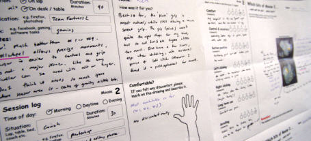
For a mouse project I had users try different prototypes and rank them against each other during a week… using paper forms.
Here are some ways I feel the old-school method holds its’ own:
It’s human
No learning curve, no teething problems. Paper and pen doesn’t require login details, needs almost no instructions, is ultra portable, and doesn’t rely on web or mobile coverage. Participants don’t have to think about or remember anything other than jotting down their thoughts.
It’s flexible
Photos are great, and really help to add context, but I’m always amazed at how pictorial some people make their diary notes. Sketching and doodling on a blank sheet of paper is always going to win over an online text-entry box.
‘till the fat lady sings
The real gems from these studies emerge in the exit interview with each participant. When they’re looking back over their own handwriting, these paper diaries transport people back to those moments in time, where you can access the rich detail needed to paint the full picture. It’s literally a trigger for them to share stories, which is where the ‘gold’ always reveals itself in interviews.
It’s immersive
I love the process of pinning-up diary data around a room.
Having met each participant, built rapport and empathy, this is somehow retained when you’re surrounded in their scrawl. All those attitudes and responses pop back in your mind, help you get into their character, see things through their eyes and in relation to their context.
When the right type of project comes along, I’ll give the ‘digital ethnography’ tools a shot, but until then, I know I’ve got paper.
UPDATE 2015: I’ve now had a crack at running a video diary study, with great success.
Even so …I’d love to hear from someone who’s run an ethno project using any of these tools.

 When I designed and made things for a living it was easy to explain what I did. People formed a mental model of what I did and pigeon-holed me instantly.


