Advice for a career change into UX

Often I’m approached by Kiwis wanting to make a sideways leap into UX and always try to help out via either introductions or advice. They usually ask about qualifications, what they can study to give them a leg-up, or where they might fit into the vast spectrum of what UX has come to stand for.

…and I can empathise with them completely.

UX is hoovering up talent from many adjacent disciplines and the job market has become a lolly scramble, with dozens of mysterious job titles and areas to specialise in.

Who wants to be a designer?, when you could be a Multi Channel Experience Architect?*
*Actual job title as advertised in 2012

In 2006, as UX was becoming ‘the new black’ of design, a brave usability company** in London hired me over candidates who must have looked waaaay better on paper. Following my instincts, I shut the doors on my design business to explore this new world.

It was sink-or-swim …at the deep end. I was the only person in the agency who didn’t have an MBA, masters or PHD in design, HCI, research or psychology.

The gamble paid off for both of us, and over the years I’ve always tried to mentor others. It feels good to help and usually takes a phone call to get a feeling for where the person is at – what they are excited by, so I can make my advice relevant to their situation.

Invariably people ask about studying, qualifications and their CV…

I’m clearly biased towards experience and ‘soft skills’ rather than qualifications and believe that people buy people, not a folio or CV – these should open the door for you, but it’s the story you tell once you’re in the room that matters.

You’ll need ‘case studies’ – examples of projects you can talk people through – explaining the process, the steps and logic behind it.

Try to cover these:

  • What the challenge was?
  • How you addressed it?
  • What the outcome was and how it benefitted the business / customers?

And bonus points for these:

  • What you learnt / would do differently next time?
  • How you see yourself applying what you learnt to projects for their clients.

These project stories are a stage from which you sell the skills and experience you’ve gained…

…but the person you’re talking to will see past the methods and techniques to ask themselves this question:

“Am I comfortable to put this person in front of our most valuable client?”

And if you’re lucky, this one too:

“Which project could I put this person on tomorrow and know they’ll be a good fit?”

Where you are at? …Where you want to be?
UX skills and activities run a spectrum from Research & Exploration at one end, to Design & Evaluation at the other. Do you want to be a generalist or a specialist? or a T-shaped person? Push the skills and aspects of yourself which you’d like to build on, but express the areas you’d like to move into;

If you want to do interaction design, cranking out page layouts then your CV / Folio should show that you can do this.

If you’re more interested in researching customer behaviour, improving customer experience, understanding the flow of a customer through a system, then your CV / Folio should have some sort of example of the process – this might be a journey map or photos taken when you were in the depths of your process.

I sometimes point people to this excellent set of slides

http://www.slideshare.net/jasonmesut/sell-yourself-better-10

…Assembled by a guy who has recruited dozens of UX practitioners from across the spectrum into agency roles or as freelancers. (He was also hired by the same brave company)

Give back.
If you’re well into your career and have anything to add, know of any courses or study options, please add them to the comments below, or mail me and I’ll add them to this list.

**The company who bravely hired me was Flow Interactive, who are now part of Foolproof, Europe’s largest UX agency, (I was once told) and whose sister company in South Africa have been absorbed by PWC.

Customer insight from… the Yellow Pages

The dull thud of a phone book hitting the desk. …Probably not a sound you’ve heard since the 90’s, but the humble yellow book, and it’s smaller, newer, blue cousin can be useful to explain the value of customer insights, especially those gathered in context…

20 years ago when the Thomson Directory went into battle with the ubiquitous Yellow Pages in the UK they wanted a point of difference – and to become the ‘most reached for’ directory over their competitor…

…By visiting people’s homes they saw the Yellow Pages not only next to the phone, but in drawers, under stairs, propping up computer monitors etc. Importantly, they noticed peoples’ behaviour – They stacked smaller books on top of  larger books.

Thomson used these behavioural insights to their advantage, producing a smaller book so it would sit on top, and be the first directory people grabbed.

The purpose, function and content remained unchanged, but a practical human behaviour sparked this significant change in the design and form factor of their product.

I’m not sure there’s a digital equivalent to ‘stacking’ items like this… but can you think of other products or services which have been shaped so fundamentally by behavioural insights?

Thanks Simon in London for the photos

…and to Ofer Deshe who told me the story a few years back.

Tool tips – When should design explain itself?

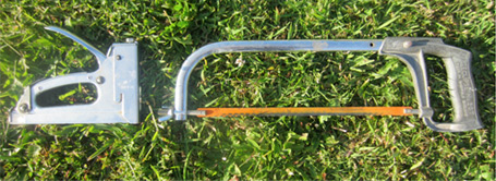
My Hacksaw and Stapler basking on the lawn

Should a hacksaw or staple gun need a manual?

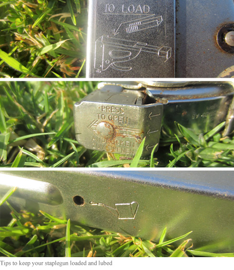
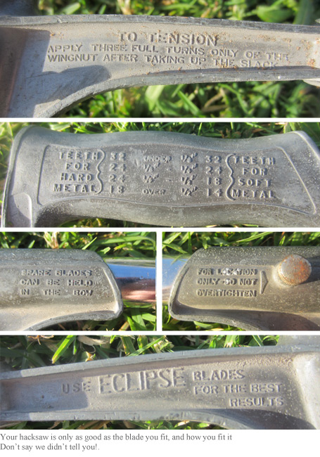
Mine have permanently moulded instructions to help get the most out of using them.

Handy hints built into my stapler

This hacksaw pre-dates the internet by 20 years, but look at all those tool tips!

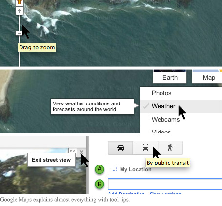
This sort of thing has become commonplace in the digital world too. Hover your cursor over any button or tool  and you’ll see prompts, tips, guidance, explanation etc. as you explore and use websites, software and devices.

Tool tips could help you find this remote New Zealand surf spot

Whether you’re using software or a saw and need that extra ‘tool tip’ …you’re generally alone, doing your own thing … so what about when you’re around other people… Can we learn by watching others?, does the ‘how to’ of using things travel by osmosis in a social or group situation? or, in other words – do people become the tool tips?

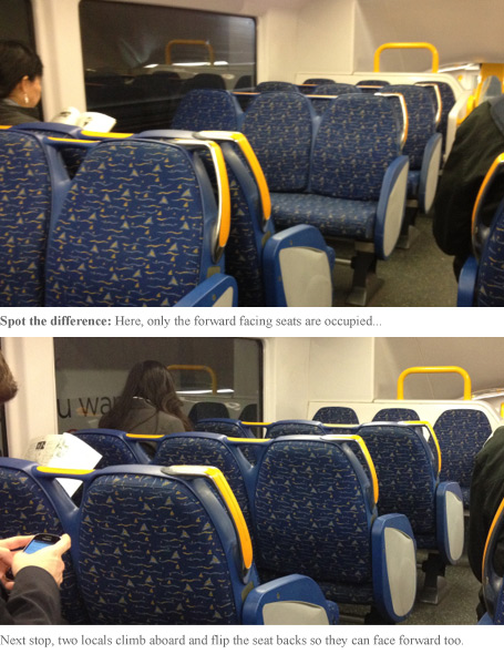
In the physical world, it seems this is true, as I noticed on a Sydney train recently.

These Sydney train seats can be switched to face either direction

You could argue the train seats should have a ‘tool tip’ to show that they can be reversed, but there’s also something satisfying about discovering it for yourself, or through watching others.

…My latest UX research project is for a multi-user ‘touch table’ designed for an exhibition space. The content is navigated by individuals and groups with a similar emphasis on ‘discovering’ how to interact with the environment, rather than being signposted at every step.

Often things in the physical world help explain user behaviour in the digital world and I’m thinking this train seat scenario might be a good analogy… but despite how much more natural it feels to be facing forward when getting from A-B, few passengers actually do change the seating around…

So, I wonder…

  1. Would a visual cue take the satisfaction away for the few to improve travelling for the many?
  2. Do people suffer performance anxiety the first time they try to move the seat? (I waited until I had an empty carriage)
  3. Are those ‘in the know’ motivated to share what they’ve learned, or do they keep it to themselves?
  4. Are we more likely to make these ‘discoveries’ in the physical or digital world?
  5. Is it possible to move through a digital journey facing backwards?
  6. Is it more valuable to discover a feature by serendipity, or to learn by observation of others?

I’d like to hear of other scenarios where people learn how to interact with a product or service purely by watching others…

…Do you know of any?

Visualising UX research

I’ve never seen clients stand around a written report gesturing at various pages discussing their implications… but when this happens with a drawing, I really feel like my job is done.

A written report can be restrictive when working with rich, emotive material, so I often use visuals to communicate insights and what they mean to my clients.

The same drawings I use to help myself ‘see the wood for the trees’ can be a valuable tool for sharing findings and concepts.

Until recently I’ve produced these to a simple but polished level:

Polished visuals can extend beyond initial graphic impact to tell stories, build context, explain relationships and show processes.  Until now I’ve used these as part of a final deliverable as they can be absorbed in a fraction of the time it takes to read a report, are well circulated and fantastic for getting buy in.

…more recently I’m using sketches earlier in a project as a different kind of tool – a platform for discussion.

Although clients don’t always consider it up-front, consensus building can be a valuable outcome from customer research. Teams across design, product, marketing etc. often need to just ‘get on the same page’.

Bringing the voice of the customer, or insights from their behaviour alive with a simple cartoon and can really get people talking.

A polished deliverable always has it’s place but the pencil is getting a workout earlier in the process these days. I’ve realised different stages of a project require different styles of visual and by using the appropriate level of detail for the audience and the decisions they face at the time, they can be one of the most powerful tools in the box.

Update:
By popular demand I’ve put a few more examples on the ‘approach’ page of my design research consulting website. … and there’s a link there to request a fuller set.

Life or death usability

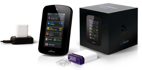
Over the last couple of years I’ve been lucky enough to be involved in the R&D programme for a ground-breaking medical device to help diabetics manage their insulin treatment.

Part of the project was to reach a regulatory milestone, which has now been achieved.

To reach this milestone we tested the usability of the device to prove it was intuitive and the design prevented people from giving themselves a mis-dose or even fatal dose of insulin.

It was amazing to work in this ‘high-stakes’ context with so many facets to the user experience:

  • an ‘out of box’ experience with crucial set-up to match the device to the user’s insulin sensitivity
  • a physical product which is injected with insulin and attached to the body
  • a touch screen device presents a learning curve for diabetics in their 70’s
  • online monitoring and visualisation of blood glucose levels – data presented in new ways
  • …and the big one… people’s health and lifestyle literally in their hands and plugged into their bellies.

Aside from having my eyes opened to the world of diabetes and being humbled by the courage of the people I met during the research, …it’s been so satisfying to see design research deliver such a tangible impact.

I worked in conjunction with London User Research Centre and with Design Science in Philadelphia.

Customer Experience conference in NZ

Next week I’m presenting at this conference.

With the US and Europe groaning under the weight of web-focused User Experience conferences, it’s refreshing and encouraging to see this offered in New Zealand.

I’ll be sharing some experiences from a home-grown design research project.

From what I can gather I’ll be the only researcher presenting and I’m hoping to demonstrate the versatility as well as the value of design research.

Maybe I’ll see you there?

Getting a Grip. Prodesign Magazine showcases my approach to UX

Design Research and User Experience article in Prodesign

This month I’m featured in Prodesign mag.

The article harks back to my days designing surfboards and the moment I became ‘hooked on usability’ during a project for Sony Playstation.

Read the Prodesign article ‘Getting a grip’ here as a PDF.

It turns out this is the last issue of this magazine after 16 years.

What does that say about design in New Zealand?

…or does it say more about print publishing?

Motivations. Delivered fresh to your door

I’m in London this month and just received a boxful of fresh produce from Abel&Cole.

Two things become very clear upon opening the veggie box;
They know who their customers are,
…and that
each customer has a different set of motivations to use the service.

A great example of this is in the friendly Spring magazine inside the box.

From a quick flick through, I’ve split out the content and some potential motivations Abel&Cole might be targeting in their customers.

  • Spring issue.  To know I’m eating what’s in season
  • Recipes.  To feel inspired
  • Large close up photos.  To feel close to the goodness
  • Place of origin.  To know where the food comes from
  • Names of growers.  To feel a connection to the source
  • Foodie person profile.  To feel I’m in good company
  • Tone of voice.  To know I’m dealing with down to earth people
  • Food facts.  To feel informed about what I eat
  • Animal welfare article.  To know that Abel and Cole cares
  • Green credentials.  To know I’m having lower impact on the planet
  • Eco focussed articles.  To feel part of a movement for good
  • Fitness related article.  To know I’m eating what’s right
  • Recipes on a budget.  To feel like I’m getting value
  • Photos of the staff.  To know who I’m dealing with

Only some of these are relevant to me, but I do see a pattern of :

To know’ and ‘To feel’

At first glance… about half of these appeal to the customer knowing they’ve made a good choice, the rest speak to their emotional motivations.

Abel&Cole have clearly done their research and spent a lot of time to deeply understand their customers. It shows in the way they’ve appealed to their motivations, peppering  emotional hooks and affirmations throughout the magazine.

I wonder though…

Does anyone actually read the magazine?
Does the usefulness of the content matter or is the message and motivational triggers behind it more important?
After thirty years in the vege business does this level of customer understanding come by default?
Perhaps Abel&Cole is a business which is by its ethical nature brimming with empathy for it’s customers?

How much of their intelligence and feedback comes through their social media channels?
To what extent do they use their delivery drivers to capture customer feedback?
Have I read too much into this?

As for the contents of the box …The veggies are all great, but as I discovered in a recent project,

It’s a lot more than just the fruit and veggies which can add goodness to the customer experience.

End to end customer experience for Swiftpoint

All too often, I’m working on one aspect of a product while valuable insights emerge relating to other areas of the broader customer experience.

Classic example: A website usability study generates feedback around physical product, brand, delivery, billing or in-store interactions.

In theory this offers double or triple whammy for the sponsor of the project. …but not always in practice.

…In some (often larger) organisations, each channel of the customer experience is ‘owned’ by a separate department, and there’s no guarantee insights will be shared with those who can use them to improve their part of the product or service.

In a welcome change I worked with a bite-sized firm where it was possible to actually ‘get everyone in the same room’, for industrial, web, marketing, packaging designers and copywriters all able to benefit from each round of research, acting on insights relevant to their design process.

Swiftpoint, a nimble Kiwi start-up were well aware their customers would interact with more than just their website, or the physical product.

I ran several streams of user research, covering all customer touch-points, knowing every insight would be put to good use.

…A refreshing change to know each part of the team could have their part of the customer experience informed by the research.

Here’s a step-by-step case study to reveal the approach I took.

Anyone else had similar experience getting this level of buy-in with small teams? … or better still, with departments in larger companies?

User Experience takes hold in NZ

These two snippets make me wonder if a customer focused approach to business and design has truly taken hold here. One’s about Banks, the other Camper-vans.

Banks were some of the first companies in NZ to make a significant investment in usability and customer research, with leading banks improving their online and offline products and services. From internet banking, to call centres and even in-branch experience. Kiwibank even used this as a point of difference.

According to a recent survey, This User Centred approach has paid off.

The up-shot of the study was that ‘Banks provide the best customer service experiences’, with 7 of the top 10 spots in the survey taken by banks.

The survey company concluded that banks were “much more customer-focused” than other service providers

With people changing banks more frequently than ever before, it’s no wonder they are discovering and paying attention to the details which matter to their customers. (Telco’s fared the worst in this survey, but that’s another story)

Oh yes, and the camper-vans.
A coachbuilding firm in industrial South Auckland who build camper-vans are advertising a ‘User Experience Design Manager’ position.

They’re looking for an industrial designer who’ll need to ‘advocate and have a strong end user focus’ with the end result being “unforgettable holiday experiences” for their customers.

…Brilliant.
Many website design firms pay lip-service to user experience, but here’s a manufacturing company who’s seen the value of UX and is backing it up with budget and action, from a strategic level right down to the factory floor.

Maybe it was osmosis, or maybe there’s an exciting undercurrent of User Experience in the world of tourism and camper-vans.

Either way this is a great sign, and perhaps something to remember when you’re next stuck behind one on a hill.