Category Archives: User research

Blog pic

Nine nourishing nuggets

Over the NZ summer, I deliberately made time to nourish my professional self.

Inspiration came from 5 podcasts, 2 books and a 2 short but atmospheric films.

I’d squirrelled dozens of potentially inspiring articles, podcasts and videos over the year, waiting to filter them for quality, then absorb them… undistracted, to the sound of cicadas.

A few were memorable, including:

  • A peculiar ‘outsider view’ on UX research,
  • Podcasts on social research and why people do what they do,
  • Interviews with designers I admire about their work, and approaches to product development,
  • A couple of rather chilling ethno-books by people who gave their all to understand another people.
  • A couple of gorgeous videos spotlighting the beauty of heavy manufacturing – sheffield style,
  • A short surf adventure in Iceland, captured in inimitable ironic Kiwi narrative.
  • … and some envy-inducing lifestyle portraits of people who’ve made creativity into a lifestyle,

Here’s a snapshot of each, and why I found it worthy brain fodder for my work in design / research:

5 Podcasts

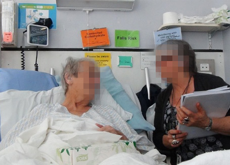
UX seduction at Etsy
Journalism meets UX research. This account of the interviewee’s perspective in a ‘usability test’ is a surreal experience given I’ve conducted hundreds of these sessions in my time.
The host of the podcast feels more like they’ve been part of an experiment than ‘helping improve a product’, and (tries to) delve into the ethics behind the way e-commerce sites steer our minds.
Hearing this makes me want to interview the interviewees from user research sessions to find out what level of cynicism and undercurrents of curiosity really does ship as standard with participants in these studies.

‘The big interview’ with Thomas Heatherwick & Monocle
I used to ride past his office in London when the models for his ‘rolling bridge’ were in the window, but the bridge hadn’t become a reality.

Now it’s in his back catalogue, and Terence Conran has declared Thomas Heatherwick ‘the Leonardo Da Vinci of our time. … a handle he’s clearly not comfortable with.
Though he gets a bit earnest at times, I was taken by his lack of ego. A humble designer untethered to a medium with a solid worship of idea over process.

He reminds me at times of the profile of Marc Newson, who in ‘Urban Spaceman’ share the same comments about being material and subject matter agnostic as a designer.

Thinking allowed
Fascinating sociology podcasts from the BBC. Laurie, the curious interviewer frames up myriad topics beautifully, then chats with people who’ve studied people in that context.

It’s good stuff. Highly conversational, so you don’t need to wade through the academic fluff as you find out about things like what motivates middle class kids who want for nothing but become drug dealers, or changing attitudes to how we navigate our careers, to children’s changing attitude to money.

Perfect podcasts for a walk around the block. If your block takes about 20 mins.

Paul Adams on Product
Never short on an opinion, and always worth listening to, Paul Adams is quite the influential voice on what it takes to make a great digital product.

We worked together at Flow, a company since absorbed into Europe’s largest UX consulting agency. Now – after serving a Silicon Valley sentence – He’s putting his learnings into play at Intercom, in Dublin, where he’s using what he refers to as the ’6-6-6’ roadmap for product development.

For those who (like me) suffer fatigue from the newfangled recipes for success, it’s summed up here as a 2min read, but the podcast is worth a listen to any product strategy or team leader.

Guerilla interviews in South Auckland 
This is guerrilla street interviewing at it’s best, by a master who really connects.
John Campbell’s authentic and probing dialogue makes you feel like you’re there with him. This is all laid down with brilliantly executed post production to stitch the story together.
There’s only a couple of these articles, but they are worth a listen, as he interviews people at the low end of the socio-economic spectrum, and very quickly gets down to brass tacks about their day to day struggle to live in our biggest city.

2 books:

On the run, with Alice Goffman

Reading this book is a little like a personal account of living in the series ‘the wire’…
…but instead of an HBO production crew, it’s seen through the lens of an ethnographer.

New York book review calls it an ‘ethnographic classic’, but it’s also been controversial.

Alice, a middle class academic moved in and spent six years living in a troubled Philadelphia neighborhood and saw first-hand how teenagers of African-American and Latino backgrounds are “funneled down the path to prison”.

This is journalism meets ethnography, and you’d expect rigour from the daughter of the “most important sociologist of the last 50 years” … So reading about her in-the field practices of note taking, logging of events etc. .. I shudder to imagine how much data she was wading through while examining these lives at such close range.

Academic sociologists felt she was too close to her subjects and took liberties in the way she wrote, while Journalists, (likely stunned at the depth and richness of her account) simply picked holes in the details, dismissing it’s value as a true account.

If you haven’t got the time to read the book… here’s a TED

Patched. when ethnography goes underground.
This book is the result of New Zealand’s largest ever study of gangs in NZ, with much of the story captured via a long and dangerous ethnography.

“I hung out with the gangs” says Jarrod Gilbert, and the stories he’s dredged up paint a rich and sometimes raw picture of this part of our social history.
He spent six years researching gangs, which meant drinking with them, listening to them, tuning motorbikes together and figuring out what to say and what not to say. He admits he was “on the wrong end of a couple of beatings” and his liver took a beating as well.

This all led to a prize-winning academic book, Patched, but like Alice and her book on life as a fugitive in Philadelphia, This author too has had their work controversially discredited by authority (in this case the Police) because he was too close to the subjects.

 2 Short films

For some eye candy I soaked up these two gems:

Barry Can’t arf Weld.
A totally gorgeous piece of atmosphilm – this short but powerful video essay rips into you with sound and motion.
Follow the journey of a few kilos of molten metal all the way to becoming a railway bogey. It’s so raw, noisy and dirty it makes you want to reach for the Swarfega.

…But then you kinda wish you could don a pair of steel caps and join in the fun in the dark and forbidding bowels of this Sheffield foundry.
Delicious.

‘Brass monkey’ surfing in Iceland.
A somehow timeless surfing ‘roadie’ flick. Filmed in in Iceland of all places by three Kiwi wax-heads mad enough to take this on.
Equal parts warming and super frosty, with the kind of dry, tongue-in-cheek-narration to bring you along on the romance of the trip.

Oh, did I say 9?

… come on, just one more …

As a some-time architect of my own lifestyle. I’m a hoover for inspiration … pondering other people’s existence. … and here at Freunden von Freunden (friends of friends) is where I found a stack:

These are styled portraits showcasing the lives of a privileged few creative people who have made a life from what they love and seek and create. Including a few Kiwis

Ok, and one more makes 11

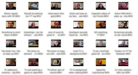
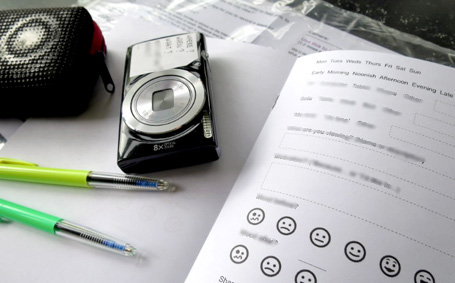
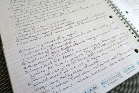
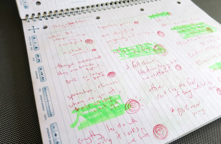
I’ve also been piecing together a wee story about my own product development – of Mr. Tappy, a mobile UX research tool. I’m as proud as I am surprised with how it’s evolved.

Great to have found the time to indulge, and now share some brain fodder and use some of those muscles which -during the year- only get a 2 minute workout on short articles.

Thanks for reading and here’s to 2016!

siggy


UX-gender-spectrum-sketch

The UX gender spectrum…

Does UX research attract more women than men?

I sometimes refer to the various roles within UX as running along a spectrum from research at one end to design at the other. It might be more convenient than realistic, but I’ve found it’s a pretty solid metaphor when asking colleagues where along the spectrum their deep skill-set lies or where they have the most fun.

…but I’d never considered each end of the spectrum might attract a different gender.

In fact, after moving from earlier careers of men and machines, I’ve enjoyed working in what’s seemed like a gender-balanced environment of UX / user centred design. I’ve even spoken out before on this when I’ve felt things weren’t quite representative.

Top Tip from IDEO's (hu)man Centred Design Toolkit.

Top Tip from IDEO’s (Hu)man Centred Design Toolkit. (2009)

So last month when speaking about visualising design research to audiences in New York and San Francisco I was surprised to notice men were significantly out-numbered by women.

In one talk there was only one man in an audience of dozens,
Another talk, only two men.

This made me wonder… was this representative of the profession?

This job ad for a design researcher at an agency in Minneapolis seems to suggest so…

designresearcher worrell2

In this ‘People understanding company’ in Europe, women outnumber men two to one.

https://www.happythinkingpeople.com/the-team/

… and a LinkedIn search seems to think so too:

A search for ‘design researcher’ in the SF Bay Area returns 26 women and 4 men in the first 30 results.

So, if there is a pattern like the rudimentary graph above…

  • Why is this?
  • What is it about the profession, that attracts more women than men?
  • Is it that women are somehow suited to design research? Why is that?
  • Has it always been this way, or is it changing?
  • What does it say about the other end of the spectrum?

And – on a professionally embarrassing note – how did I miss such a fundamental demographic trend in my own industry, given that spotting patterns in people is a core part of my work?

Perhaps some of you lovely men AND women readers can answer some of these curly questions?


Nick prototyping a customer journey map

Visualising Design Research

How to put down your bullet points and pick up a pencil…

I’ve almost given up on delivering written reports as a UX research output, favouring video and large scale visuals instead. (I explain why here)

How to:

In this article I’ll walk through my process and the tools I use, in the hope you can do something similar for your clients.


This is also a way to share some of the content of a few talks I gave in NY and SF in 2015, about visualising design research.

My talk ran through how I’ve blended communication styles from former careers in art and architecture to communicate the types of insights we find in UX research projects, where I’ve found traditional reports just don’t cut it.

One thing I wanted to be sure my audiences took away was a feeling of “I could totally give that a go on my next project”.

So if after reading this article you’re not thinking like that, I’ve missed the mark. Doh.


Here’s one I prepared earlier:

Design research illustration by Nick Bowmast

For ‘Ward life’, a project for a healthcare client – I was asked for only visual deliverables, as the team found the video/poster combo so compelling on our previous project it left the report in the dust. 

Knowing there would be a visual at the end, I photographed the process so I could share it.

The goal was to understand the social and emotional experience of patients in a shared hospital ward situation. I partnered with a chaperone (who’s also a natural interviewer) and we hit the wards – spoke to nurses, patients, their families etc., emerging later with insights – as you do.

This part of a research project is where you need to start considering how best to communicate what you’ve found…


Here are the steps I took to convert a set of findings into this visual:

FIRST: Lay out your key insights.

These can be single words, or statements.
Arrange these in a way which best frames the messages you want to communicate.
Insights-on-floor-600

Group around themes and sub-themes, relationships, this one feeds into that one etc.
While doing this I’m thinking of a narrative. A starting point and the flow, or the way I want the viewer to take in the content.
In this case I’ve grouped the insights around:

  • The patient’s context
  • Their mindset and moods
  • Environmental factors which contribute to their experience
  • The importance of distraction
  • The psycho-social aspects of being in the shared ward, and in a single room.

… and as I’m doing it I’m realising, how these relate to each other.

Thinking in two dimensions.

This is a bit like ‘storyboarding’ – you’re essentially weaving a story, frame by frame.
I’ve found moving the parts around directly on paper is a great way to build a story, and helps me join the dots between the things I’ve found and what they mean.

Sketch-1-600

You’ll need to be acting out a dialogue in your mind, between the content and the audience… converting this dialogue into a visual format. Think about the story you want to tell, where you want to place the accent and importance, and the quotes you want to use (speech or thought bubbles).

Rather than drawing all the ‘things’ I’ve just drawn text boxes or a description of what it should convey, like here it might be ’Patient in bed with ipad’ so my collaborators have an idea what I’m thinking.
Working at this basic level means it’s easy for people to contribute, add texture or meaning where it’s needed. (Like suggesting ‘patient wearing headphones’ etc.)

Add people and props.

This is the part where you literally put the people in the picture and think about the words and phrases you want to use.

Sketch-2-600

Your audience will be drawn to illustrations of people and the text immediately connected to these, so give thought to where you want this attention. At this stage I use a few stick or bubble figures with speech bubbles as placeholders to give myself, (and sometimes a client) a sense of how we could portray what’s going on in the moments / interactions in the patients’ world.

Make a list, and go shopping.

When I’m feeling happy with the arrangement and have an idea of which parts of the story should be supported by illustrations , it’s time to give the stick figures an upgrade.
I literally list out all the drawings I need and think about which ones I can draw, and which ones I’ll need help for.

ShoppingList-600
And when I say help, I mean Google Image Search. Here I typed in ‘Hospital bed’ to get an idea how these looked from a couple of angles. If you’re not so confident at drawing these things from screen, try printing them out and tracing them. Just hold them up to a window if it’s from a photo.

Keep it simple.

I try to avoid drawing busy scenes, so reduce illustrated elements to only where they will add value and support the narrative.
This means blob-headed androgynous people, sometimes without arms and other details. My experience is that it’s about what’s written in the speech bubble rather than whether your sketch of a person is wearing trainers or brogues. That’s why you didn’t realise the person pushing the tea trolley was male or female, let alone naked (!)

teatrolley-600
As you can imagine a finer level of detail can be handy at times, for example I could have had a stethoscope round the neck to identify a doctor in this image, but it wasn’t important enough to add it.

By the end of this you should have line drawings on paper ready to be scanned so you can put them into a digital document.

Drawings-in-ink-600

Get digital.

Open up a layout program that handles images and text. (I use Adobe Indesign) and set a massive document size. This one was about 1400mm wide x 900mm high. (You’re going to print this out BIG).

indesign-600

From here, use the ‘Text box’ tool to add in all your text as individual elements, then import your scanned drawings and go to work arranging these, being faithful to your paper mock-up.

Establish hierarchy.

Ok, it’s bit of a high-falooting word, but once I’ve got all the content loosely arranged I usually go about assigning a few type ‘styles’ so I can use sizing and bold etc. Creating this visual hierachy adds prominence and weight where it’s needed.

IndesignDetail-600

I’m usually thinking – “If someone’s only going to spend one minute looking at this, what do I want to be sure they’ll take in?”

… then assign extra weight to those elements. It’s not just a matter of making things bigger, sometimes giving more space around them can help with this.

Boxes and arrows.

It’s no coincidence that software toolkits have boxes, arrows, shapes and lines. This combo (and text of course) is all you really need, and doesn’t take long to get the hang of.

In this visual I’ve used boxes to say ‘these belong together’ some triangles for big arrow heads, and for the floor and walls I used the line tool where you just keep clicking corner points, then choose a colour for the ‘fill’.

closeup-600
After text and speech bubbles, (an oval and a triangle joined together) arrows are one of the hardest working tools in the box – particularly for non-linear artefacts like this one.  They help guide the viewer around, and show the links and sequence of things.
Indesign or even much less sophisticated programmes will have an easy toolbox and menu of line and arrow types, thin ones, fat ones… Mix it up!

Colouring in.

I keep things in black-white and greys as long as possible to make sure the message is getting across without colour, then go to Adobe Kuler to pick a palette of 3-5 colours, using some to add depth, and one or two for accents.

Printing.

Go BIG.
I recommend you call your local print shop, ask them how wide their roll is, and make this the shortest dimension of the printout.

Printing a UX research poster
A ‘wall sized’ visual (as opposed to individual A3 printouts) gets more eyeballs.

A poster provides a shared experience, get’s people out of their seat and generates the sort of response and conversation that matters to your project.

If you’ve read this far, you probably agree that ‘generating conversations that matter’ is a job text based reports all-too-often fail at.

So …pick up your pencil and start a conversation.


Video diary study highlights screening

Capture the moment with video diary studies

Two and three at a time, 25 diary study packs arrived back by courier – this time containing not just logbook and photos but a video camera – 300+ self-recorded clips from selected moments during the previous week.

I had no idea what to expect from the video, but very quickly began to wonder why I hadn’t done this before?
Yep, after watching the first few clips I had struck ethno-gold by using video-selfies in a diary study project.

Diary studies are great for capturing interactions with a product or service which play out over time. I’ve tended towards keeping things old-school with paper based diary studies followed by exit interviews and always been pleased with the results, but after adding video to the mix, it’ll be hard to look back from here.

What resulted was a raft of in-the-moment, rich and raw footage offering an intimate, personal perspective which unfolds beautifully over time. With clips from different times of day, contexts etc. you really get a feel for the way the person’s week went and feel somehow more connected to their mindset during each interaction or moment they documented.

workshop ladies with wayne

Self-shot video combined with stills and printed verbatims combine to provide a powerful platform for conversation.


Here’s how the project unfolded, and a few things I learned along the way:

How to capture the footage?

We looked at a few options, with our main goal being to keep things as simple as possible for the participants capturing the data, and us wrangling it later.
We considered using their own phones, setting up video blogs, and even using managed services like www.watchmethink.com, but we needed to move fast and to have control over the technology and format, so opted for buying a fleet of cameras. No guesswork!.
We went for fairly basic and compact point-and-shoot cameras with HD video and of course stills too. Looking back it’s hard to think of a cleaner, simpler way to go about it.

Setting up the diary packs:

Diary study laid bare

Camera-CHECK, Charger-CHECK, Logbook-CHECK etc….

We put together 25 identical packs, containing;

  • Camera with stills and video capability.
  • Intro sheet – describing the objectives of the project and where the participant fits in.
  • Idiot-proof instructions on how to use the camera – recording video, charging etc.
  • Guidelines on some types of moments to capture with video.
  • Log book and pens, with a mix of simplified multi-choice checkboxes for recording the what, where, when, and how, plus an open text field for the why?…which is what we were most interested in.

Keep it loose.

The last thing you want is a participant thinking twice whether the thing they think is important will be useful to you, so don’t be too prescriptive with your suggestions of which moments are worth capturing.

I had figured on filming a sample clip to give people an idea what I was looking for, but am glad I didn’t as our sample exercised their creative freedom to capture some surprising moments in ways and from contexts we never would have imagined.

We let our participants decide themselves which moments were important / relevant to them. This seemed a little ‘open to interpretation’ but paid off in spades as it revealed key differences between individuals – super relevant to our study.

Unboxing and setup.

boxes and packaging

Allow several hours for getting the cameras ready. (I completely underestimated this).
Next time I’d make this a two person production line – opening boxes and packaging, charging batteries, prying SD cards from impenetrable plastic shells, printing info sheets, numbering and assembling all the kits.

sd cards clipped

Come face to face with consumer guilt as you unpack all this guff.

If you’re of the green persuasion, perhaps go plant a tree afterwards to get over the consumer guilt of dealing with all the packaging. Ok, better make that two trees actually.
Set up every camera the same, particularly the video capture resolution. This saves handling different image formats during editing.

Test pilot.

Absolutely DO Run a pilot. Ask a friend or two to follow your instruction sheet to shoot a couple of clips. You’ll quickly discover where more information, (or less) is needed in your supporting material.

Say what?

Get creative with your prompts, but let your participants do their own thing too.

Get creative with your prompts, but let your participants do their own thing too.

We put a sticker next to the lens with some very loose prompts to help our participants get to the ‘why?’. We did this after the pilot session and it worked a treat across the sample.


Packs away!

Include your contact details in each pack, on the camera if you can, so participants can let you know if something’s up. I’ve been contacted on every diary study I’ve done.

Also, a day or so after they’ve received the pack, call the participants to make sure they are in the groove with what’s expected of them. Keep this call short, a minute or two should do the trick.

Primed to share.

I’ve found diary study data is pretty bland on it’s own and the real flavour of the individual comes through in the exit interview. Somehow the act of logging their actions raises participants awareness of their intentions and behaviours. While there may be some downside to this, I believe this ‘priming’ opens some doors in their mind, making for deeper and more valuable, access-all-areas exit interview conversations.

Say vs. do.

I like to think I’ve got a great bullshit detector, but hearing participants speak in retrospect about their behaviour during the week, and comparing that to the self footage was a good reminder that what people say they do and what they actually do can be very different. For this reason, be sure to watch some of the footage before the exit interview, and even better then watch it again without he participant. They might even surprise themselves.

Pulling it all together.

clips in window

With so many clips to sort through I key-worded the file names to remind me what they contained.

How to handle and share all that footage?.
From the 300 or so short clips I weaved together a carefully edited highlight reel of a few dozen ‘moments’ from the video-selfies. When combined with snippets from the exit interviews, this offered a colourful and authentic ‘voice of the customer’ narrative as a ‘week in the life’ unfolded across many contexts.

Being there in the moment.

I’ll definitely be doing this again, but welcome any other techniques for getting into people’s lives when it’s just not possible to be there in the moment. I know there are other ways to approach this, so please hit me with your top tips in the comments below…

Or go ahead and record a selfie?

diary close up

Smartpens are such an essential item in my kit, I've got a few for when a team hits the road.

Use a smartpen to free your eyes and mind during UX research

Two eyes, two ears and one mouth –

…We’re all born with these essential three tools for user research.

The proportions are about right too. …until your eyes get busy looking at the notes you’re taking rather than observing behaviours and maintaining eye contact during the interview.

If you’re a solo researcher, electronic eyes and ears are useful too, but it’s a depressing reality that from one hour of interview footage there may only be a few minutes from the recording that are used to frame your insights later.

When you’re listening, thinking to yourself “this stuff she’s saying is total gold” the best case scenario is to be able to quickly find those nuggets when you’re back in the office… which is entirely possible if you take notes like this:

If you're taking notes like this AND trying to interview someone, you're missing the point.

If you’re taking notes like this AND trying to interview someone… you’re missing the point.

Capturing verbatim notes comes at the cost of having an only halfway natural conversation. This is why despite experimenting with many approaches and technologies, I keep coming back to using a smarten to take notes during fieldwork, or even usability testing products.

A smartpen lets me focus on the conversation, then just nip back to highlighted moments later. It records audio as you scribble, synchronising the audio to the marks you make on the page.

This frees my eyes to pick up on body language, expressions and mannerisms, and think about where the conversation is going … meanwhile, I’m highlighting key moments in the conversation, for quick and easy recall after the session. Having the exact wording wrapped in the tone of voice from the moment, at the tap of the pen is simply brilliant.

Knowing you’ve got full ‘recall’ from the pen means you can take notes as detailed or skimpy as you like, so over time I’ve adjusted my notes to the bare minimum. Most of what I write is written without looking at the page, except for a quick initial glance, so I’ve adopted a ‘shorthand’ note-taking format of keywords and symbols:

These spirals tell me where to tap to go back to the magic moments

These spirals tell me where to tap to go back to the magic moments

I scribble squiggly circles next to key words according to the ‘weight’ of the moment, in the moment. More circles means more emotion / intensity etc.

I might write down a short quote if I can do so without any interruption to the flow, but I’m much more likely to jot down a keyword or phrase as the person is talking, holding their gaze while drawing a star or squiggle etc.

These marks are my visual shortcuts to audio moments

These marks are my visual shortcuts to audio moments

In an ideal world I don’t take notes at all. I film the whole session and transcribe it while reviewing the video footage.

This allows total focus during the interview and is a great way to re-immerse in the moment, but it can be a painful trawl through the footage to pin-point those moments or killer quotes for an edited video.

So my new default is to get the smarten AND the video camera rolling at the same time.

As I’m going back to ‘tap and play’ my notes, I can read the time code from the little screen on the pen. Having this time code makes a total doddle out of pulling together a ‘highlights’ clip from acres of footage.

Tap - and Boom! you're back in the moment to the nearest second.

Tap – and Boom! you’re back in the moment to the nearest second.

Best of all – knowing all the goodness is being captured and I can cherry-pick the best bits later means I’m able to relax during the interview and build real rapport with the person, and frees up my eyes to do their job.

At the end of an hour of interviewing, I might have 2 or max 3 sides of pretty scrawly notes on an A4 pad with a couple of dozen scribbly dots of different sizes, some underlined words, maybe some little sketches or doodles .. and it’s all time linked to audio.

Nobody could understand the notes but me… but it just so so rich with the audio accompaniment.

Weeks later you can go back and re-listen to a particular utterance at the drop-of-a-hat. Tap, listen, bingo…

I’m obviously sold on this, but would really love to hear…

How do you handle the dual task of note taking and interviewing when flying solo during in-home customer experience research?

Meanwhile, I’ve got my Two, Two and One… plus the smartpen.

The one I use is called a Livescribe , and in the 5 years I’ve been using them they’ve developed a raft of additional functionality, but I literally only use the pen to record and playback, but if anyone’s found a reason to use the extra wifi whizz-bang, I’m all ears.

Curiosity-tablets

Ethnography. Only the curious need apply

How can a product team gain empathy for their customers and draw meaningful insights if they aren’t driven by their own curiosity?

I’ve been helping client teams to plan and conduct their own design research, ‘going ethno’ with small teams to meet and study their end users in context. Initially I had my reservations, (and many live on) but…

…it’s been a learning experience on both sides:

I generally encourage clients to ride shotgun with me during fieldwork. It’s an engaging way for them to meet their customers, get inside their heads and fall in love with their problems.

Increasingly these teams want a lasting version of design research goodness – learning how to do it for themselves – often as part of a broader move to a customer-centred mindset, and as a rule I’m all-for passing on my approach and techniques.

But where to start? I’m self-taught through running dozens of these projects without a scrap of training, or ever reading a book, so how should I go about passing this goodness on to my clients?

With a mild dose of impostor syndrome, I initially tried up-front ‘ethnography 101’ style coaching, role-playing, ‘primer’ exercises, guerilla research and even wrote ‘how-to’ field guides covering interview and recording techniques etc. – only to be disappointed.

So, why weren’t all these client teams as interested in their own customers as I was?

In search of a tutorial silver bullet and a way to get these clients into the right mindset, I’ve read, gifted, recommended, quoted and paraphrased from all four of these books for my clients:

curiosity-book-covers-455

If in doubt – consult your manual?

These books are great fodder for the aspiring or even seasoned researcher, reminding you that what you do actually is ‘a thing’ …(and you can even call it ethnography) but having tried a few methods of ‘coaching’ I’m not convinced any amount of reading can move the needle on your clients’ curiosity-meter.

…in fact latent curiosity seems all-too-rare regardless how much permission and context you provide or how well you prepare teams upfront to ‘go ethno’.

Exposure to customer-world can ignite this desire to learn, but even well-intentioned members of a product team can fail to gain empathy with their customers or draw meaningful insights if they aren’t driven by their own desire to learn.

Yes, that glimmer of curiosity in your clients’ eye is worth more than all the ‘how to’ books ever published, and on these assignments, my goal is to bring that out in my client. Tossing the books aside, I’ve found it’s way simpler than I thought.

The glimmer of curiosity is a platform to build their skills on, and my response is to go with less ‘how to’ and more ‘let’s do’:

  1. Lay a few ground rules, (rather than a lecture or lesson)
  2. Dive into a live project. (something they care about, not a hypothetical example)
  3. Review and share learnings as you go.
  4. Fuel and follow your team’s curiosity.

It seems all the tips, techniques, handbooks and best intentions aside, it seems real world experience sorts the ‘men from the boys’ in terms of building this desire to learn.

…But the changing and unpredictable nature of peoples’ behaviours and now knowing what you’re going to learn is addictive, and the curiosity and drive to dig deeper can spread by osmosis. So if you’re in a ‘coaching’ role, show them the rewards and they’ll want to make the investment in learning the skills.

So… what about you…?

How have you managed to up-skill your clients in user research?

Has this been deliberate, at their request, or a useful bi-product of attending your fieldwork?

The books I read and shared from were:

Interviewing users. Steve Portigal

Practical ethnography. Sam Ladner

Talking to humans. Giff Constable

Practical empathy. Indi Young

User research is valuable. Now get on with it.

It’s official, customer insights lead to better products.

During 2014 I noticed a proliferation of articles like this one (McKinsey) championing user research as a somewhat untapped source of design inspiration and product innovation.

It’s no surprise with ‘design thinking’ infecting the corporate world with it’s 5-step process, beginning of course with … understanding the customer. (Thanks d-school)

So while the business and design worlds are falling in love with customers problems, healthcare and other public sector services are adopting a user centred approach, why is user research still flirting and wanting to be noticed?

User Research UX design research
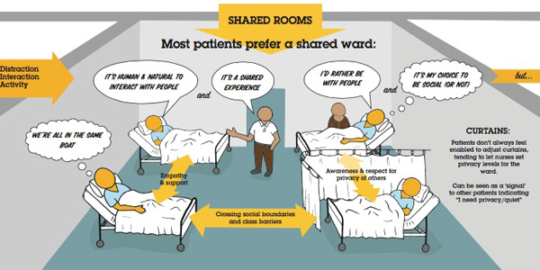
Google have a stab at answering this question in their article ‘What fuels great design and why most startups don’t do it?

Through my own experience I can vouch all these barriers exist, but they are increasingly being broken down, and if the UK government can be wrangled into shape (good work to @leisa, @jwaterworth & the team at GDS) then … the future has never looked brighter.

So with the world we’ve been trying to win-over for so long realising (and exercising) the value of this work, being all ‘empathy‘ and ‘get out of the office‘. And with armies of corporates tasting the design thinking kool-ade during half-day versions of ‘ethnography’ … then coming back for more … it would seem our day has come. No?

Let’s put the years of ‘broken record’ evangelism of UX and bangings-on about how valuable our role is to bed and redirect this energy into delivering value.

Well, that’s my plan and I’m sticking to it.

Will you join me?

Nick.

Curious? Go cold turkey to gobble the insights

Curiosity is one of a UX researcher’s most valuable traits, but it’s also a vulnerable one, because it can be dissolved by a little knowledge.

I’ve found it’s handy to have a few hunches in my back pocket, but when I’m trying to understand a customer – the less I know about them, the more curiosity I’ll need to find out.

Wary of this, I work hard to defend my naiveté, particularly during the early stages of a project. I’ll try to be selective about what information I take on the road, and what I leave parked in the office…

Here’s an example of how I try to maintain my curiosity:

At kick-off, I usually help my clients brief a recruiter with criteria to fetch a representative sample of customers*. The recruiter provides a schedule and participant list with granular details of every participant – name, address and three contact methods will be their demographics, customer type, attitudes and attributes which were collected when they were screened. It’s an eye-bleeder, but part of the process.

Design-research-spreadsheet

A recruiter typically provides an ugly-but-data-packed spreadsheet with more than you need to know.

During this process I invariably learn about customer segments, what they mean to the business and a taste of the client’s base level understanding of their customer. It gives some insight into each person I’ll meet, but I find it’s better not to know at this stage.

Start with a blank canvas.

To defend my curiosity, I pick only three of these details** to stick to the car dashboard:

  1. Time of appointment
  2. First name
  3. Address
Spare the details: I leave all the other customer information in the office and out of mind.

Spare the details: I only take the basics on the road.

I do this because…

I want to interview a person, not a ‘customer segment’…

Because I’m starting the interview with such minimal information, I let the customer paint me a picture which brings all those details the surface, and it’ll take every bit of my curiosity to draw them out.

It’s a small detail, but I believe this makes a big difference to the pace and direction of the interview.

For example – on my current project, we’re interviewing a mix of three customer types; subscribers, non-subscribers and ex-subscribers. All three are relevant and I don’t want to be pigeon-holing them in my mind before I’ve walked in the door, or for them to feel like ‘they’ve been picked for a reason’.

If I know she’s an ex-customer, a part of me will be wondering, “why did she cancel her subscription?” I’ll be looking for clues, reading between the lines and may draw this to the surface before she’s had a chance to fully describe her context. Or she might detect I’m on this thread and defend her reasons for leaving the service, which isn’t what I want to hear.

… so I prefer to go in ‘cold-turkey’, letting these details all come out ‘in the wash’ in the customers words as part of a natural, unbiased conversation. (at least, that’s the way I want it to feel for the customer).

There’s plenty of time for answers later, these are valuable and expected outputs of any design research project, but I’ve found NOT knowing the answer is the best possible position to be in when you’re heading into the field to interview and observe people interacting with your product.

This is part of trusting your instinct as a researcher, being comfortable with ambiguity and being ‘in the dark’.

Earlier in the year I wrote about how a Calligrapher / Monk / and Ex- Xerox PARC innovation researcher approaches these uncomfortable research situations: Humble pie, served on a bed of chaos.

…but he doesn’t mention being in the dark with a cold turkey?


*If you’re going to invest in spending some time with your customers, it pays to be sure your sample is representative of your customer base and represents the challenges . I believe this is worth taking seriously, and well worth paying a recruitment firm to handle for you.

**Sometimes I’ll add the age and/or gender of the participant. Gender is not always obvious from the name and in mixed households having a little more information helps you get your greeting right at the door.

Respect, instinct and bedside manner – My patient experience toolkit.

Interview

Design research in a hospital environment is super rewarding. You’ll reveal a wealth of insight and opportunity to improve patient experience but face some unique challenges, especially when interviewing patients at their bedsides.

With a few of these projects under my belt it’s time to share, in case you’re ever in the humbling position to do the same. (yes, more humble pie)


My top tips for patient experience research:

Instinct:

This work will squish everything you’ve got in your soft skill set. You’ll be relying on your instinct for what’s ‘right’ and ‘polite’ in the circumstance. I think doctors call this ‘bedside manner’ …you’re going to need a good one.

Respect and empathy:

visiting-hours

Be considerate – happy hour or not.

It goes without saying to be sensitive to this context.
You’re asking people to share their thoughts or story when out of their comfort zone and feeling vulnerable, emotional, philosophical or all of the above.  Try to relax patients – make them comfortable, offer to top up their water, pass things, adjust curtains, charge their phone.

Authentic moments:

I prefer to ‘cold call’ on patients at their bedside, inviting them to share their experience on the spot. This lacks the certainty of ‘appointments’ but adds in-the-moment authenticity you simply don’t get if you give people the chance to collect their thoughts and arrange themselves in advance.

Mood-reading:

A chatty, social ward is a good place to find stories.

Each ward or room has it’s own atmosphere, from patients trying to sleep while machines gently beep, through to chat and laughter of visiting families. You’ll need to quickly read the mood and adjust your tone and approach to suit. Pick a lively, social ward and you might find patients are more willing to participate. (but beware of the bias this introduces).

Occupational hazards:

While you’re building empathy for each patient’s circumstance and viewpoint, some of their emotional load will shift to you by osmosis. This is a sign you’re doing a great job of listening, but be ready for emotional exhaustion at the end of each day.
To avoid becoming a patient myself, I start necking immune boosters and vitamin C the week before this work and wash your hands frequently during each day.

Introductions – Staff:

It’s essential ward staff know who you are, and what you’re doing in their working space. I’ve always had a chaperone who’s known and trusted by the staff introduce me and the project objectives. Without this, nurses will be suspicious of who you are and what you’re up to.

Introductions – Patients:

“Hi, I’m Nick, and I’m not a doctor”

Patients will assume you’re clinical staff, a specialist, or coming to discharge them, so get any expectation out of the way as part of your greeting.

Leaderboard

Ward staff will point you to the most appropriate patients to talk to, and those to avoid.

Ask staff to suggest which patients are appropriate, and not appropriate to approach. This can save embarrassment for you and patients if they are not completely ‘with it’.

Interviewing:

Maintaining eye contact and looking for non-verbals is essential in this context. You’ll need to record each interview and review later, or bring a note taker.
If it’s your turn to take notes, sketch-noting works very well for feelings, emotions, environmental factors etc. and is super easy to socialise later.

Patients love to see what all that doodling was about, and usually and valuable comment.

Patients love to see what all that doodling was about, and will elaborate on aspects given the chance.

Here are my top tips for sketch-noting during an interview:

Follow-up:

Ask for permission to interview the patients after discharge in their homes. The in-context interview will be revealing, but you’ll hear a different perspective and mood when they reflect on their in-ward experience.

Kit / recording:

Cameras are an even bigger distraction than usual on a hospital ward, so if you’re filming interviews (and it can be very compelling footage in this context) conceal your camera until you have each patient’s permission to film.

Clear audio is a priority.  Patients in a shared ward will tend to whisper out of respect for privacy of others, or so as not to be eavesdropped. Go for a wireless lapel microphone or at least a directional one.

The contents of my bag when I hit the road on an ethnography / contextual inquiry / design research

The contents of my hospital kitbag are sparse compared to this lot for home visits. (image from my article in link below)

Check out my article ‘Ethno unpacked –  A design researcher’s toolkit‘ for details of the gear I use.


Oh, and one more thing…

 SMILE

The more I work in this context, the more I feel like a newbie, and there’s much more to learn.

What have I missed?

What are your experiences?

Games people play during user research

How and why I use games as ‘tools for talking’ during fieldwork interviews…

User Research TechniquesA couple of universal truths stand in the way of discovering what people actually think and do:

What people do and what people say are rarely the same.

Equally, what people think, and what they say are very different.

Annoyingly, but reliably, these rear their heads during customer interviews and ethnographic studies – the two main methods I use to gain insights from people.

In practice they work like this:

Customers will alter their behaviour if they know they are being watched, This is known as the ‘Hawthorne effect‘.

And they’ll most certainly have a self-edit running while they are being interviewed, so they’ll tell you the things they think you’re wanting to hear.

Apart from a pretty strong ‘bullshit detector’ and the ability to read between the lines I use ‘games’ to get around these conflicts.

I make simple activities – prompts with words and pictures – for customers to arrange right in front of me.

These help customers express perceptions, beliefs, attitudes, emotions and preferences. Uncovering ‘the why?’ behind these, bringing a richer, more accurate picture to the surface.

Most commonly I use a variation of one of these:

Journey.

Plotting a sequence of events or process by placing items in the order they happened. I often have the participants add a series of ’emotion cards’ to highlight highs and lows etc.

After a mad-dash of shopalongs in a retail CX project, this participant maps the highs and lows of her experience.

After a mad-dash of shopalongs in a retail CX project, this participant maps the highs and lows of her experience.

For this home buying study I've used yellow and blue cards as positive and negative emotions. Top marks to this participant for serving cheese and crackers!

Here I’ve used yellow and blue cards as positive and negative emotions. Top marks to this participant for serving cheese and crackers!

Grouping.

This is a bit like a ‘card sort’, but less about categorising and more about arranging by value, importance, usefulness etc.

Design research card sort

Here I asked customers to sort services by value to them – ‘could have’, ‘should have’, ‘must have’ and ‘deal breaker’ – Explaining their choices as they went.

I gained great insight for a retail interior design project by asking customers to arrange images of retail environments.

Mapping.
Working out which goes with what. Great for understanding why people make certain choices.

Customers here were able to map services to their preferred channel. Note: I've included 'It depends' as an option. Because sometimes, it just does.

Customers here were able to map services to their preferred channel. Note: I’ve included ‘It depends’ as an option. Because sometimes, it just does.

As you can see, the materials are bespoke to the project, and I take great care to plan them, keeping them to a manageable number (you don’t want to spend more than 15 mins on an activity like this)

So, here are my top tips:

It’s not data.
These activities are all about the conversation, not collecting data.
There may be some patterns in the arrangements, but on face value they are nowhere near as useful as the thoughts they helped elicit from the customer.
I might photograph the final arrangement, but the real value lies in what the customer has shared in describing it, justifying their placements and what this means to them.

Kickstart a conversation.
Many times I’ve had a conversation go from prickly to fluid around these activities, so it can help break the ice. Perhaps some people are more comfortable with ‘something to do’, during the interview. The customer will visibly relax, letting me into their stream of thoughts, where I want to be.

How to facilitate?
Depending on the person and the topic, I sometimes leave them to complete the activity on their own, making a mental cache of their movements, then reflect on these afterwards, or I’ll have them talk me through every step, (known as ‘think aloud‘ in usability world).

Either way, when I can literally hear them thinking, it’s a good time to prompt them for their thoughts.

Be a ‘thought sniper’.
You’ll want to seem ‘distanced’ from the subject, (they might feel like you’re watching them with one eye as you pretend to check your twitter feed) but you’ve got your sights on their every move.

Watch for the pauses and hesitations, confidence in placement of cards.

Underlying these movements are the nuances which, when expressed verbally, can reveal the kind of insights you’re looking for.

Freestyle.
Always include a few ‘blank’ cards and have a pen handy. You’re unlikely to have covered every eventuality or option in your set of cards, so let customers make their own.

Try to have the activity on a sheet of paper, so customers can draw rings around groups, links between items etc.

What have I missed?

There’s no way in the world I’m the only person who uses these techniques, so if you’ve got something to add, please add it in the comments or send me an example and I’ll add it to the post. Thanks!