Category Archives: UX methods

Zane Lowe. Learned to listen.

Listening. How hard can it be?

Ask Global Creative Director at Apple Music, who says they’ve ‘really only just learned to listen’.

Zane Lowe has been described as New Zealand’s most successful music export, one of the UK’s top radio broadcasters and is now the creative force behind Apple Music.

Fancy. But as a professional listener myself, it’s the thousands of insightful interviews he’s racked up with artists that interest me. And what helped him learn to listen. Continue reading

Breaking the wall in design research

Breaking the wall in Design Research


Film directors use a term to describe zooming out from the scene to deliberately demystify the production process.

This reveals backstage activity usually out of the frame, like the edges of the studio set, sound crew, equipment etc..

They call this ‘breaking the wall’.

Thanks to an ambitious client, and a two minute edit from a mountain of footage, I feel like I can do something similar, at least trying to answer some design research FAQs I’m often asked. In particular the approaches and practicalities of fieldwork. Continue reading

Architectural design, meets pop-surrealism to communicate research insights

See what I mean? (Video)

A few weeks back at our very own UX Homegrown conference, I shared my story of how I combined visual communication styles from two former careers into a way to make research insights visual, and generate conversations that matter.

Here’s the video:

It was the first time I’ve spoken at an event in NZ for over three years, but it’s a story I love telling.

The story plays out over years as confidence grew, and clients encouraged me to put down the bullet points, and pick up a sharpie.

You’ll see what a slow learner I was, but I share my ‘how to’ techniques to help you get there quicker. And it seems to be working – since I first shared this story and these techniques, I’ve had some great emails from people who wouldn’t consider themselves a ‘visual person’ attaching their ‘first stabs’ – examples of visual artefacts, explaining the impact they noticed in how their team responded etc.

If you’re tired from the insights from your work gathering digital dust, and you’re feeling sketchy after the video, I go step by step through my approach in an article ‘Visualising Design Research‘ from a couple of years back.

Now go sharpen your pencil, and send me some shots!

Sharing design research findings is a bit like one of 'those' jokes

You had to be there. (Video)

Like one of ‘those’ jokes, design research has the most impact to those who were there in the moment.

In this video – from a presentation hosted at eBay Design in San Francisco – I explain how I try to help client teams discover their own punchline from user research, by designing experiences for them rather than delivering findings to them.

Continue reading

Nick prototyping a customer journey map

Visualising Design Research

How to put down your bullet points and pick up a pencil…

I’ve almost given up on delivering written reports as a UX research output, favouring video and large scale visuals instead. (I explain why here)

How to:

In this article I’ll walk through my process and the tools I use, in the hope you can do something similar for your clients.


This is also a way to share some of the content of a few talks I gave in NY and SF in 2015, about visualising design research.

My talk ran through how I’ve blended communication styles from former careers in art and architecture to communicate the types of insights we find in UX research projects, where I’ve found traditional reports just don’t cut it.

One thing I wanted to be sure my audiences took away was a feeling of “I could totally give that a go on my next project”.

So if after reading this article you’re not thinking like that, I’ve missed the mark. Doh.


Here’s one I prepared earlier:

Design research illustration by Nick Bowmast

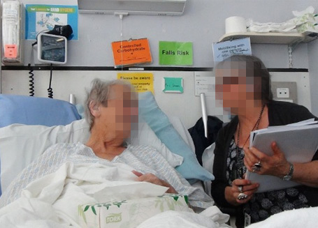
For ‘Ward life’, a project for a healthcare client – I was asked for only visual deliverables, as the team found the video/poster combo so compelling on our previous project it left the report in the dust. 

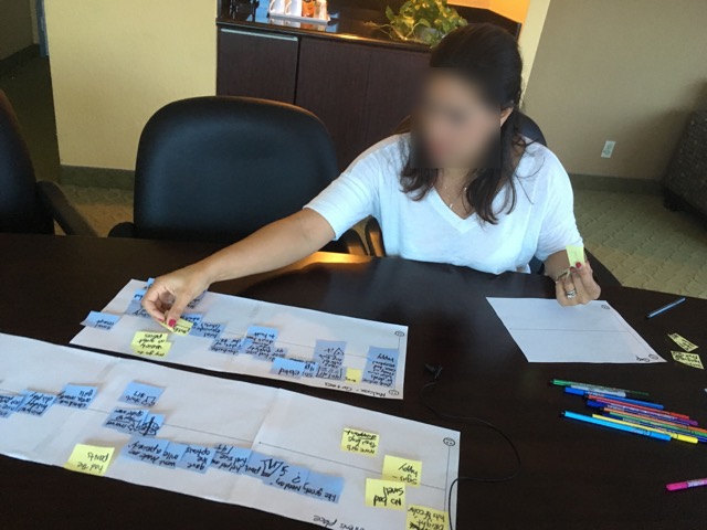
Knowing there would be a visual at the end, I photographed the process so I could share it.

The goal was to understand the social and emotional experience of patients in a shared hospital ward situation. I partnered with a chaperone (who’s also a natural interviewer) and we hit the wards – spoke to nurses, patients, their families etc., emerging later with insights – as you do.

This part of a research project is where you need to start considering how best to communicate what you’ve found…


Here are the steps I took to convert a set of findings into this visual:

FIRST: Lay out your key insights.

These can be single words, or statements.
Arrange these in a way which best frames the messages you want to communicate.
Insights-on-floor-600

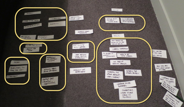
Group around themes and sub-themes, relationships, this one feeds into that one etc.
While doing this I’m thinking of a narrative. A starting point and the flow, or the way I want the viewer to take in the content.
In this case I’ve grouped the insights around:

  • The patient’s context
  • Their mindset and moods
  • Environmental factors which contribute to their experience
  • The importance of distraction
  • The psycho-social aspects of being in the shared ward, and in a single room.

… and as I’m doing it I’m realising, how these relate to each other.

Thinking in two dimensions.

This is a bit like ‘storyboarding’ – you’re essentially weaving a story, frame by frame.
I’ve found moving the parts around directly on paper is a great way to build a story, and helps me join the dots between the things I’ve found and what they mean.

Sketch-1-600

You’ll need to be acting out a dialogue in your mind, between the content and the audience… converting this dialogue into a visual format. Think about the story you want to tell, where you want to place the accent and importance, and the quotes you want to use (speech or thought bubbles).

Rather than drawing all the ‘things’ I’ve just drawn text boxes or a description of what it should convey, like here it might be ’Patient in bed with ipad’ so my collaborators have an idea what I’m thinking.
Working at this basic level means it’s easy for people to contribute, add texture or meaning where it’s needed. (Like suggesting ‘patient wearing headphones’ etc.)

Add people and props.

This is the part where you literally put the people in the picture and think about the words and phrases you want to use.

Sketch-2-600

Your audience will be drawn to illustrations of people and the text immediately connected to these, so give thought to where you want this attention. At this stage I use a few stick or bubble figures with speech bubbles as placeholders to give myself, (and sometimes a client) a sense of how we could portray what’s going on in the moments / interactions in the patients’ world.

Make a list, and go shopping.

When I’m feeling happy with the arrangement and have an idea of which parts of the story should be supported by illustrations , it’s time to give the stick figures an upgrade.
I literally list out all the drawings I need and think about which ones I can draw, and which ones I’ll need help for.

ShoppingList-600
And when I say help, I mean Google Image Search. Here I typed in ‘Hospital bed’ to get an idea how these looked from a couple of angles. If you’re not so confident at drawing these things from screen, try printing them out and tracing them. Just hold them up to a window if it’s from a photo.

Keep it simple.

I try to avoid drawing busy scenes, so reduce illustrated elements to only where they will add value and support the narrative.
This means blob-headed androgynous people, sometimes without arms and other details. My experience is that it’s about what’s written in the speech bubble rather than whether your sketch of a person is wearing trainers or brogues. That’s why you didn’t realise the person pushing the tea trolley was male or female, let alone naked (!)

teatrolley-600
As you can imagine a finer level of detail can be handy at times, for example I could have had a stethoscope round the neck to identify a doctor in this image, but it wasn’t important enough to add it.

By the end of this you should have line drawings on paper ready to be scanned so you can put them into a digital document.

Drawings-in-ink-600

Get digital.

Open up a layout program that handles images and text. (I use Adobe Indesign) and set a massive document size. This one was about 1400mm wide x 900mm high. (You’re going to print this out BIG).

indesign-600

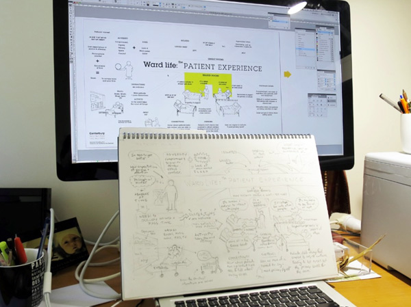
From here, use the ‘Text box’ tool to add in all your text as individual elements, then import your scanned drawings and go to work arranging these, being faithful to your paper mock-up.

Establish hierarchy.

Ok, it’s bit of a high-falooting word, but once I’ve got all the content loosely arranged I usually go about assigning a few type ‘styles’ so I can use sizing and bold etc. Creating this visual hierachy adds prominence and weight where it’s needed.

IndesignDetail-600

I’m usually thinking – “If someone’s only going to spend one minute looking at this, what do I want to be sure they’ll take in?”

… then assign extra weight to those elements. It’s not just a matter of making things bigger, sometimes giving more space around them can help with this.

Boxes and arrows.

It’s no coincidence that software toolkits have boxes, arrows, shapes and lines. This combo (and text of course) is all you really need, and doesn’t take long to get the hang of.

In this visual I’ve used boxes to say ‘these belong together’ some triangles for big arrow heads, and for the floor and walls I used the line tool where you just keep clicking corner points, then choose a colour for the ‘fill’.

closeup-600
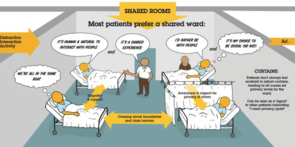
After text and speech bubbles, (an oval and a triangle joined together) arrows are one of the hardest working tools in the box – particularly for non-linear artefacts like this one.  They help guide the viewer around, and show the links and sequence of things.
Indesign or even much less sophisticated programmes will have an easy toolbox and menu of line and arrow types, thin ones, fat ones… Mix it up!

Colouring in.

I keep things in black-white and greys as long as possible to make sure the message is getting across without colour, then go to Adobe Kuler to pick a palette of 3-5 colours, using some to add depth, and one or two for accents.

Printing.

Go BIG.
I recommend you call your local print shop, ask them how wide their roll is, and make this the shortest dimension of the printout.

Printing a UX research poster
A ‘wall sized’ visual (as opposed to individual A3 printouts) gets more eyeballs.

A poster provides a shared experience, get’s people out of their seat and generates the sort of response and conversation that matters to your project.

If you’ve read this far, you probably agree that ‘generating conversations that matter’ is a job text based reports all-too-often fail at.

So …pick up your pencil and start a conversation.


Respect, instinct and bedside manner – My patient experience toolkit.

Interview

Design research in a hospital environment is super rewarding. You’ll reveal a wealth of insight and opportunity to improve patient experience but face some unique challenges, especially when interviewing patients at their bedsides.

With a few of these projects under my belt it’s time to share, in case you’re ever in the humbling position to do the same. (yes, more humble pie)


My top tips for patient experience research:

Instinct:

This work will squish everything you’ve got in your soft skill set. You’ll be relying on your instinct for what’s ‘right’ and ‘polite’ in the circumstance. I think doctors call this ‘bedside manner’ …you’re going to need a good one.

Respect and empathy:

visiting-hours

Be considerate – happy hour or not.

It goes without saying to be sensitive to this context.
You’re asking people to share their thoughts or story when out of their comfort zone and feeling vulnerable, emotional, philosophical or all of the above.  Try to relax patients – make them comfortable, offer to top up their water, pass things, adjust curtains, charge their phone.

Authentic moments:

I prefer to ‘cold call’ on patients at their bedside, inviting them to share their experience on the spot. This lacks the certainty of ‘appointments’ but adds in-the-moment authenticity you simply don’t get if you give people the chance to collect their thoughts and arrange themselves in advance.

Mood-reading:

A chatty, social ward is a good place to find stories.

Each ward or room has it’s own atmosphere, from patients trying to sleep while machines gently beep, through to chat and laughter of visiting families. You’ll need to quickly read the mood and adjust your tone and approach to suit. Pick a lively, social ward and you might find patients are more willing to participate. (but beware of the bias this introduces).

Occupational hazards:

While you’re building empathy for each patient’s circumstance and viewpoint, some of their emotional load will shift to you by osmosis. This is a sign you’re doing a great job of listening, but be ready for emotional exhaustion at the end of each day.
To avoid becoming a patient myself, I start necking immune boosters and vitamin C the week before this work and wash your hands frequently during each day.

Introductions – Staff:

It’s essential ward staff know who you are, and what you’re doing in their working space. I’ve always had a chaperone who’s known and trusted by the staff introduce me and the project objectives. Without this, nurses will be suspicious of who you are and what you’re up to.

Introductions – Patients:

“Hi, I’m Nick, and I’m not a doctor”

Patients will assume you’re clinical staff, a specialist, or coming to discharge them, so get any expectation out of the way as part of your greeting.

Leaderboard

Ward staff will point you to the most appropriate patients to talk to, and those to avoid.

Ask staff to suggest which patients are appropriate, and not appropriate to approach. This can save embarrassment for you and patients if they are not completely ‘with it’.

Interviewing:

Maintaining eye contact and looking for non-verbals is essential in this context. You’ll need to record each interview and review later, or bring a note taker.
If it’s your turn to take notes, sketch-noting works very well for feelings, emotions, environmental factors etc. and is super easy to socialise later.

Patients love to see what all that doodling was about, and usually and valuable comment.

Patients love to see what all that doodling was about, and will elaborate on aspects given the chance.

Here are my top tips for sketch-noting during an interview:

Follow-up:

Ask for permission to interview the patients after discharge in their homes. The in-context interview will be revealing, but you’ll hear a different perspective and mood when they reflect on their in-ward experience.

Kit / recording:

Cameras are an even bigger distraction than usual on a hospital ward, so if you’re filming interviews (and it can be very compelling footage in this context) conceal your camera until you have each patient’s permission to film.

Clear audio is a priority.  Patients in a shared ward will tend to whisper out of respect for privacy of others, or so as not to be eavesdropped. Go for a wireless lapel microphone or at least a directional one.

The contents of my bag when I hit the road on an ethnography / contextual inquiry / design research

The contents of my hospital kitbag are sparse compared to this lot for home visits. (image from my article in link below)

Check out my article ‘Ethno unpacked –  A design researcher’s toolkit‘ for details of the gear I use.


Oh, and one more thing…

 SMILE

The more I work in this context, the more I feel like a newbie, and there’s much more to learn.

What have I missed?

What are your experiences?

Games people play during user research

How and why I use games as ‘tools for talking’ during fieldwork interviews…

User Research TechniquesA couple of universal truths stand in the way of discovering what people actually think and do:

What people do and what people say are rarely the same.

Equally, what people think, and what they say are very different.

Annoyingly, but reliably, these rear their heads during customer interviews and ethnographic studies – the two main methods I use to gain insights from people.

In practice they work like this:

Customers will alter their behaviour if they know they are being watched, This is known as the ‘Hawthorne effect‘.

And they’ll most certainly have a self-edit running while they are being interviewed, so they’ll tell you the things they think you’re wanting to hear.

Apart from a pretty strong ‘bullshit detector’ and the ability to read between the lines I use ‘games’ to get around these conflicts.

I make simple activities – prompts with words and pictures – for customers to arrange right in front of me.

These help customers express perceptions, beliefs, attitudes, emotions and preferences. Uncovering ‘the why?’ behind these, bringing a richer, more accurate picture to the surface.

Most commonly I use a variation of one of these:

Journey.

Plotting a sequence of events or process by placing items in the order they happened. I often have the participants add a series of ’emotion cards’ to highlight highs and lows etc.

After a mad-dash of shopalongs in a retail CX project, this participant maps the highs and lows of her experience.

After a mad-dash of shopalongs in a retail CX project, this participant maps the highs and lows of her experience.

For this home buying study I've used yellow and blue cards as positive and negative emotions. Top marks to this participant for serving cheese and crackers!

Here I’ve used yellow and blue cards as positive and negative emotions. Top marks to this participant for serving cheese and crackers!

Grouping.

This is a bit like a ‘card sort’, but less about categorising and more about arranging by value, importance, usefulness etc.

Design research card sort

Here I asked customers to sort services by value to them – ‘could have’, ‘should have’, ‘must have’ and ‘deal breaker’ – Explaining their choices as they went.

I gained great insight for a retail interior design project by asking customers to arrange images of retail environments.

Mapping.
Working out which goes with what. Great for understanding why people make certain choices.

Customers here were able to map services to their preferred channel. Note: I've included 'It depends' as an option. Because sometimes, it just does.

Customers here were able to map services to their preferred channel. Note: I’ve included ‘It depends’ as an option. Because sometimes, it just does.

As you can see, the materials are bespoke to the project, and I take great care to plan them, keeping them to a manageable number (you don’t want to spend more than 15 mins on an activity like this)

So, here are my top tips:

It’s not data.
These activities are all about the conversation, not collecting data.
There may be some patterns in the arrangements, but on face value they are nowhere near as useful as the thoughts they helped elicit from the customer.
I might photograph the final arrangement, but the real value lies in what the customer has shared in describing it, justifying their placements and what this means to them.

Kickstart a conversation.
Many times I’ve had a conversation go from prickly to fluid around these activities, so it can help break the ice. Perhaps some people are more comfortable with ‘something to do’, during the interview. The customer will visibly relax, letting me into their stream of thoughts, where I want to be.

How to facilitate?
Depending on the person and the topic, I sometimes leave them to complete the activity on their own, making a mental cache of their movements, then reflect on these afterwards, or I’ll have them talk me through every step, (known as ‘think aloud‘ in usability world).

Either way, when I can literally hear them thinking, it’s a good time to prompt them for their thoughts.

Be a ‘thought sniper’.
You’ll want to seem ‘distanced’ from the subject, (they might feel like you’re watching them with one eye as you pretend to check your twitter feed) but you’ve got your sights on their every move.

Watch for the pauses and hesitations, confidence in placement of cards.

Underlying these movements are the nuances which, when expressed verbally, can reveal the kind of insights you’re looking for.

Freestyle.
Always include a few ‘blank’ cards and have a pen handy. You’re unlikely to have covered every eventuality or option in your set of cards, so let customers make their own.

Try to have the activity on a sheet of paper, so customers can draw rings around groups, links between items etc.

What have I missed?

There’s no way in the world I’m the only person who uses these techniques, so if you’ve got something to add, please add it in the comments or send me an example and I’ll add it to the post. Thanks!

My sharpest user research analysis tool


I’ve found it’s easier to ‘see the wood for the trees’ if you’re chopping them with a sharp axe.

Yep, I just had my usual cord of firewood dumped by the shed and once again I’m finding it’s a useful medium when analysing data from a UX research study.

I’ve just had a week on the road interviewing people in their homes and am now faced with the mammoth task of reviewing all my footage / notes / photos and artefacts from the trip, then making sense of it.

A formally trained researcher might call this process extraction, collation, analysis and synthesis of data. For many like me who come into research ‘through the side door’ (like I did from the surf industrythere’s a certain mystery to the process, and it can take a few projects to get comfortable with it. What’s more, it can be straight out daunting…

…yes, a bit like a truckload of firewood needing to be cut, sorted and stacked into piles.

… Back to the pile of data though and most likely your first encounters will involve shuffling hundreds of sticky notes round the walls of a small room, bumping into furniture and getting high on solvent-based markers. There’s a lot of pattern spotting and theme building and as a rule it’s a hugely immersive process.

Time can equally stand still, or race by, and your brain aches under the weight of a thousand echos – things you saw, heard or felt during your interviews.

T I M E   &   S P A C E

I’ve found it’s important to step away from the piles of sticky notes, into a new environment where your mind can wander. Running or the gym might be your thing, but for me, it’s chopping wood.

A monotonous task like chopping, sorting and stacking firewood is a perfect partner to working through all that data.

I escape the pastel patchwork walls and kill those echos in a single chop of the axe as I try to guess which way the log will split, or whether I’ll need the bigger axe for the knotty pieces?, which way the grain goes? and so on.

Time can play tricks on me in this mode too, but I surrender to it. As I’m splitting and stacking away I let my own thoughts come into play alongside the project objectives. This is where the strongest insights emerge for me, and they seem to come from instinct.

There’s something magic about walking back into the ‘war room’ with a few splinters and a fresh perspective, or even a challenge to the direction you’re on, and I’ve found it comes not from total immersion, but from giving yourself the space to let your own mind sort through the findings.

Dream design research projects from 2013, Part 2

The second half of the year was no less exciting with client work, but was boosted by the buzz of my own product hitting it’s stride in the market.

From July to December: Home brewing, TV, Mr. Tappy and Motorhomes.

Here goes…

5. Craft brewing insights

Location: Portland, Oregon. Micro brewery capital of the world.

Client: imake / (Part of the Better by Design programme).

Portland is the world’s capital of micro breweries and craft brewers. Visiting with imake’s team from NZ, Australia and USA, we stepped inside the garages, basements and minds of craft brewers, aiming to understand what makes them tick, and how they approach brewing.

My role as part of Better By Design is to help build design capacity within NZ export companies like imake. In many cases this starts with understanding customer needs, so getting out in the field like this was a perfect first step towards customer empathy.

In Oregon, I briefed the team on how to get the most from contextual interviews, supported them in the field, then coached them through collaborative analysis.

A deep dive into brewing culture, but my satisfaction came in that it was the client team who drew out the insights and identified opportunities for marketing and product development.

6. How do you view?

Client: SKY TV.

Location: Around NZ.

A classic contextual study in homes around NZ to understand how TV fits into people’s lives and how? / when? / where? / why? they get their fix.

Having run studies like this for BBC and SKY in the U.K. back in the late noughties it was super interesting to see shifts in consumer expectation and behaviour. Back then it was ‘time-shifting’, now it’s ‘omni-screening’. From devices to content sources, this felt like a ‘snapshot in time’ in the dynamic landscape of TV.

Insights from this project fed into new product development and an upcoming redesign of SKYTV.co.nz.

7. Tapping into the mobile market

Client: My alter ego – Mr. Tappy.

Location: My kitchen table, and 30 countries.

Yes, from kitchen table to global tech giants in 2 years and just 700 easy steps.

My side-project, Mr. Tappy, (a product I’ve developed to help film people interacting with mobile devices) continued to surprise me with sales to the point where I can nearly hear myself blush when I see my list of customers.

Taking this product to market has been a humbling learning curve for me. Even when working alone I find myself being design, marketing, sales, distribution, customer service, etc., discovering how easy it is to work in silos and lose customer focus – Something nobody can afford to do, especially when your customers are expert product evaluators.

Having ‘skin in the game’ has resulted in greater respect for my design research clients‘. Running day to day operations, and shipping product is challenge enough let alone keeping an eye on customers. This first hand experience helps me understand my role as a design researcher with each client.

The entire product is made right here in NZ (some in my home workshop) and the next iteration will ship with a purpose designed HD camera.

8. Living the dream, via your own motorhome

Client: Tourism Holdings.

Location: Australia and NZ.

We’ve all been stuck behind one on a hill on the way to the beach, but what’s it like to buy a home, and a vehicle at the same time? We set out to find out.

I worked alongside Ed Burak, THL’s lead experience designer to provide research muscle on a project around motorhome sales. Motorhome buyers are a fairly relaxed bunch, usually at retirement age and with some time on their hands, but buying one of these rolling holiday homes is not always a holiday.


From a few dozen interviews with owners, buyers, salespeople and experts, we poured our insights into a customer journey map highlighting parts of the buyers’ journey where the experience could be improved.

… and as you’ll see, some of my illustrations  for the journey map were verging on the autobiographical. Yes, the waves were always like that in my memories.

…What’s next?

All the talk of holidays and time away was perfect timing for the end of 2013 and inspired me to use the caravan (which was once my office) a few times over the Christmas period. Good timing.

If you missed my previous post, here are the first four dream design research briefs from last year.